The *rate* of new jobless claims, at all-time lows, forecasts even lower unemployment I thought I’d start out with something I haven’t looked at in awhile: initial jobless claims as a share of the population and as a leading indicator for the unemployment rate. This economic expansion has featured two contrary extremes in the labor market: low wage growth and increasingly vanishing layoffs (I don’t think that’s a coincidence, but that’s a subject for another post!). Let’s take a look. The first graph below is of weekly jobless claims as a share of the entire labor force. To generate this, I also take into account “covered employment.” That is, not all jobs are eligible for unemployment insurance, and because of part time work and the gig economy, that
Topics:
NewDealdemocrat considers the following as important: Taxes/regulation, US/Global Economics
This could be interesting, too:
Joel Eissenberg writes How Tesla makes money
Angry Bear writes True pricing: effects on competition
Angry Bear writes The paradox of economic competition
Angry Bear writes USMAC Exempts Certain Items Coming out of Mexico and Canada
The *rate* of new jobless claims, at all-time lows, forecasts even lower unemployment
I thought I’d start out with something I haven’t looked at in awhile: initial jobless claims as a share of the population and as a leading indicator for the unemployment rate.
This economic expansion has featured two contrary extremes in the labor market: low wage growth and increasingly vanishing layoffs (I don’t think that’s a coincidence, but that’s a subject for another post!). Let’s take a look.
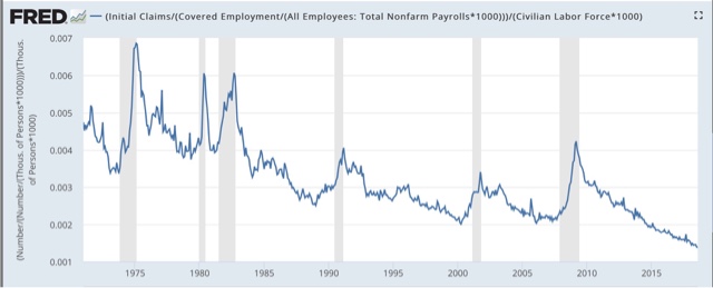
The first graph below is of weekly jobless claims as a share of the entire labor force. To generate this, I also take into account “covered employment.” That is, not all jobs are eligible for unemployment insurance, and because of part time work and the gig economy, that share is less than it had been previously. So, first I divide the average number of jobless claims over a month by the percent of covered employment. The lower the share of covered employment, the higher the adjusted layoffs number. Then I divide that in turn by the number of people, both employed and unemployed, in the labor force. Here’s what I get, through August:
We are now experiencing the lowest percentage of people getting laid off as a share of the labor force, for the entire 50 year plus history of the data. As of August, only 138 out of 100,000 people were getting laid off each week (obviously, given that employment is growing, a bigger number were getting new jobs). Put another way, you almost have to work at getting laid off these days!
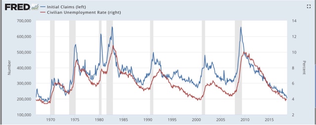
Secondly, initial jobless claims tend to lead the unemployment rate by a few months. Here’s the 50 year+ graph:
If jobless claims decline, then over the next 2-3 months it’s a good bet that the monthly unemployment rate will decline too.
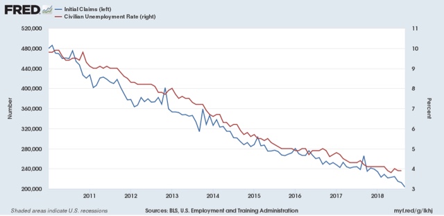
Not every zig and zag is followed, but the general relationship is clear. Note that initial jobless claims have continued to make new 48 year lows this month (September).
The unemployment rate made its most recent low of 3.8% in May. Based on the relationship with initial jobless claims, we should expect it to go even lower by the end of this year.


