Scenes from the August jobs report 1. The strong trend of people entering the jobs market and getting jobs remains intact Here’s a nice graph put together by Kevin Drum at Mother Jones showing both a linear and curvilinear trend line (which are nearly identical) (red) with the prime age employment to population ratio (blue): The trend is intact and quite positive, despite the one month decline. 2. Involuntary part-time employment is near 25 year low levels. The below graph is of involuntary part time employment as a share of the entire labor force, from which I have subtracted 2.7% to norm the rate at zero: Involuntary part time employment — the primary addition forming the basis of the broad U6 underemployment rate — has dropped to levels
Topics:
NewDealdemocrat considers the following as important: US/Global Economics
This could be interesting, too:
Joel Eissenberg writes How Tesla makes money
Angry Bear writes True pricing: effects on competition
Angry Bear writes The paradox of economic competition
Angry Bear writes USMAC Exempts Certain Items Coming out of Mexico and Canada
Scenes from the August jobs report
1. The strong trend of people entering the jobs market and getting jobs remains intact
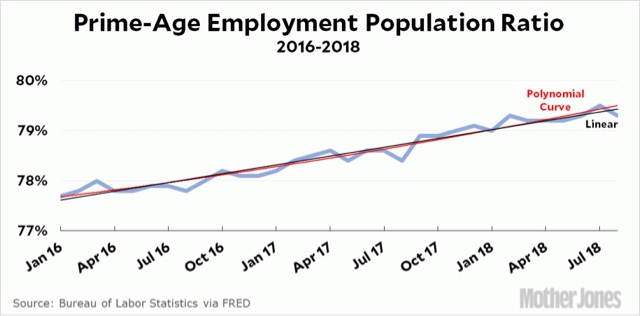
Here’s a nice graph put together by Kevin Drum at Mother Jones showing both a linear and curvilinear trend line (which are nearly identical) (red) with the prime age employment to population ratio (blue):
The trend is intact and quite positive, despite the one month decline.
2. Involuntary part-time employment is near 25 year low levels.
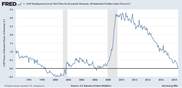
The below graph is of involuntary part time employment as a share of the entire labor force, from which I have subtracted 2.7% to norm the rate at zero:
Involuntary part time employment — the primary addition forming the basis of the broad U6 underemployment rate — has dropped to levels only seen for two months in the 2000s expansion, and exceeded for 3 years at the end of the 1990s internet boom.
3. But the percent of those who aren’t even looking for work but want a job remains slightly elevated and has started to increase
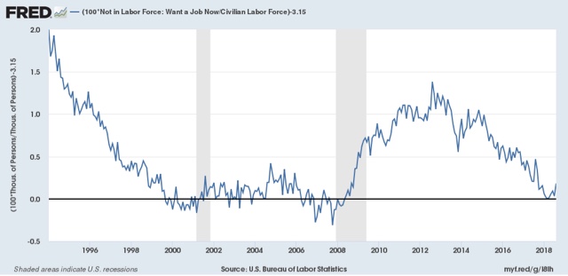
The below graph is of those “not in the labor force who want a job now” as a percent age of the entire labor force, from which I have subtracted 3.15% to norm the recent low from March to zero:
This has never returned to either 1990s or 2000s levels, and has risen in the last 5 months. It might just be noise, or it might not.
4. Goods-producing employment has been soaring . . . BUT
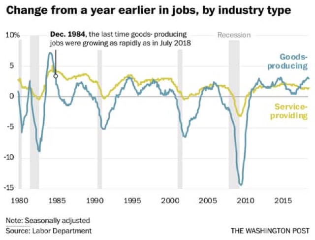
This graph comes from Matt O’Brien at the Washington Post. Goods producing jobs have recently risen at 35 year highs:
This is mainly due to two things: (1) the post-2016 recovery in the Oil Patch; and (2) truck and railcar production. The latter is *extremely* pro-cyclical, as a mere slowdown in growth at the final goods levels means a sharp downturn in the orders for new trucks and railcars to support that growth.
One important note of caution about this trend: in the past, even a two month sequential decline in the rate of growth of goods producing jobs has usually meant a sharp cyclical slowdown at minimum. I counted only 3 occasions in the last 50 years where that was not the case.
And on that note, August growth slowed down from 3.75% YoY to 3.5% YoY. Since I am expecting a sharp slowdown in the economy by about midyear next year, if a second straight month of deceleration were to be reported next month, that would be a significant yellow if not red flag.


