Coronavirus dashboard for June 23: focusing on deaths, and the Trumpist South and Southwest Confirmed total US infections: 2,312,302. (+31,433 in past 24 hours) Confirmed total US deaths: 120,402 (+425 in past 24 hours) We know that new cases are accelerating again. Is it translating into an increase in deaths? The answer appears to be: not yet, but getting close. Here is the 7 day average of new deaths in the US: Figure 1 In the past 3 days, the decline has ceased at roughly 610/day. A regional look shows that the decline in new deaths has stopped everywhere except in the Northeast. The first graph shows the 7 day average of deaths in the Northeast and Midwest; the second the South and West: The Northeast still has the highest death rate
Topics:
NewDealdemocrat considers the following as important: Healthcare, US/Global Economics
This could be interesting, too:
Bill Haskell writes Families Struggle Paying for Child Care While Working
Joel Eissenberg writes How Tesla makes money
Joel Eissenberg writes RFK Jr. blames the victims
Angry Bear writes True pricing: effects on competition
Coronavirus dashboard for June 23: focusing on deaths, and the Trumpist South and Southwest
Confirmed total US infections: 2,312,302. (+31,433 in past 24 hours)
Confirmed total US deaths: 120,402 (+425 in past 24 hours)
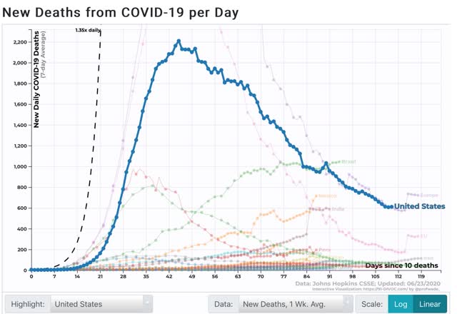
We know that new cases are accelerating again. Is it translating into an increase in deaths? The answer appears to be: not yet, but getting close.
Here is the 7 day average of new deaths in the US:
 Figure 1
In the past 3 days, the decline has ceased at roughly 610/day.
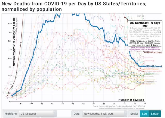
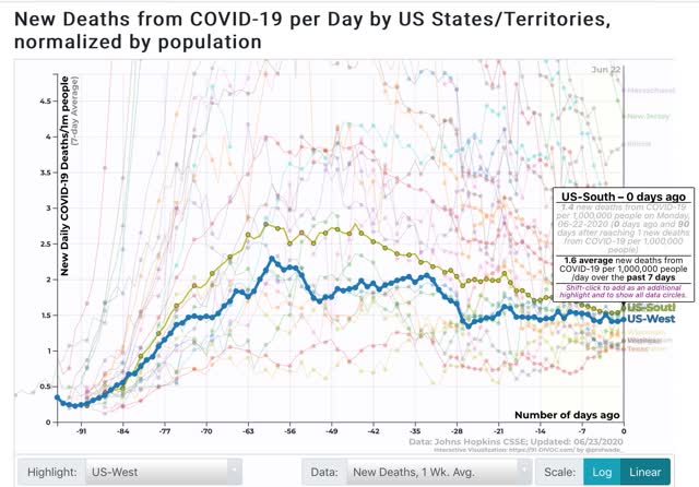
A regional look shows that the decline in new deaths has stopped everywhere except in the Northeast.
The first graph shows the 7 day average of deaths in the Northeast and Midwest; the second the South and West:


The Northeast still has the highest death rate per capita, at 2.8 deaths per day per million, with the Midwest at 2, the South at 1.6, and the West at 1.4. But the trend in the South and West has been flat for the past week, and the Midwest for the past few days. Only in the Northeast has the rate continued to decline sharply, masking the ominous trends in the other regions.
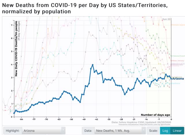
Finally, here are the 10 highest jurisdictions by 7 day average in death rates per capita:

Since the graph doesn’t show trends that well, here is the list, including whether the rate has been rising, falling, or flat over the past 7 days:
RI 7.0 (declining)
The list remains dominated by States in the Northeast, plus Illinois, where the rate of deaths has continued to fall. Three States where cases have been increasing (Mississippi, Louisiana, and Arizona) have joined the list with rising death rates.
I expect this transition to continue. I expect US death rates as a whole to begin to climb in the next few days, and for States in the South and West to replace States in the Northeast over the next 10 days. Very discouraging.
The question now is, are Trumpist GOP States subject to the same pain threshold that others were earlier? I think they are, but they will arrive there kicking and screaming, and ready to relax again at the very first opportunity.
