Coronavirus dashboard for June 29: renewed exponential growth in infections, decline in deaths has stalled Total US infections: 2,549,069, 42,161 in last day Total US deaths: 125,803, 273 in last day Here is the regional breakdown of the 7 day average of new cases per capita: There is renewed exponential growth in the South and West. The Midwest also is beginning to look bad. Also, here is some more evidence that, when you recklessly reopen, and the pandemic roars back, customers pull back, thus defeating the entire purpose of “reopening the economy:” The scientific phrase for this phenomenon is, “Well, duh!” The “top 10” States for new infections per capita are now dominated by the Confederacy, plus Arizona and Utah: However, while
Topics:
NewDealdemocrat considers the following as important: Healthcare, US/Global Economics
This could be interesting, too:
Bill Haskell writes Families Struggle Paying for Child Care While Working
Joel Eissenberg writes How Tesla makes money
Joel Eissenberg writes RFK Jr. blames the victims
Angry Bear writes True pricing: effects on competition
Coronavirus dashboard for June 29: renewed exponential growth in infections, decline in deaths has stalled
Total US infections: 2,549,069, 42,161 in last day
Total US deaths: 125,803, 273 in last day
Here is the regional breakdown of the 7 day average of new cases per capita:
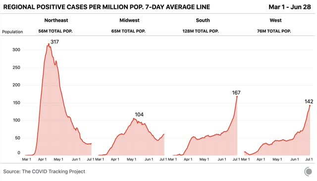
There is renewed exponential growth in the South and West. The Midwest also is beginning to look bad.
Also, here is some more evidence that, when you recklessly reopen, and the pandemic roars back, customers pull back, thus defeating the entire purpose of “reopening the economy:”
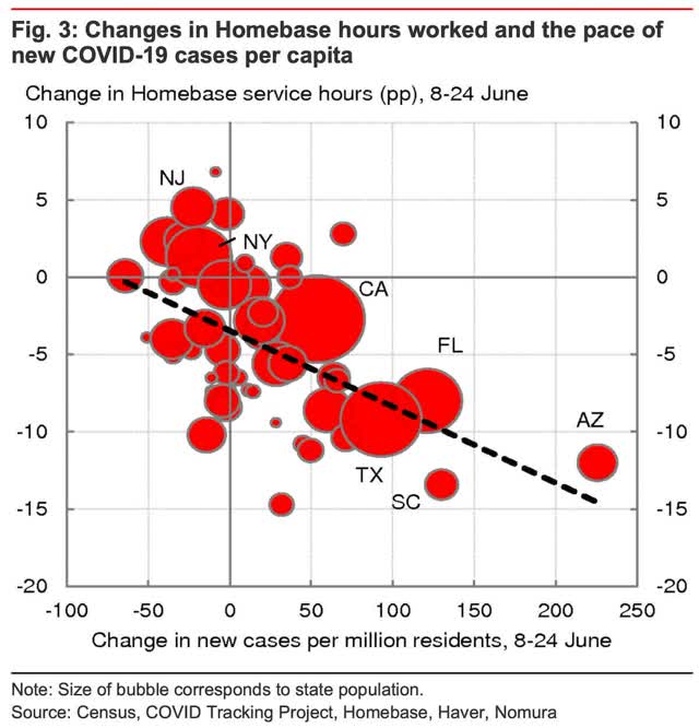
The scientific phrase for this phenomenon is, “Well, duh!”
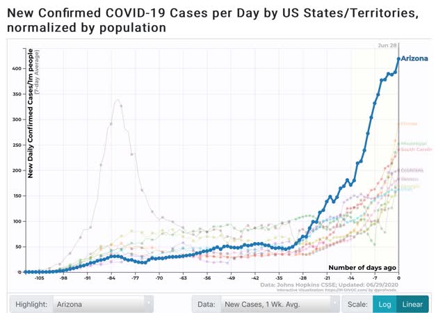
The “top 10” States for new infections per capita are now dominated by the Confederacy, plus Arizona and Utah:
However, while Arizona now heads the “top 10” jurisdictions for deaths per capita, and Louisiana, Arkansas, and Florida have joined the list, the majority is still from the Northeast megalopolis where the death rate, while steeply declining, remains high:
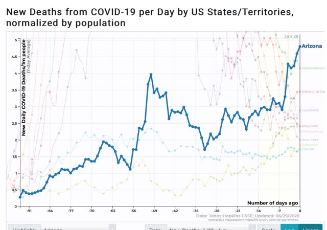
I expect the Northeastern States and DC to drop out of this list over the next 7 to 10 days.
Aside from the situation in the recklessly reopened States, the big issue has been the disconnect between new cases and deaths. The main driver is almost certainly the demographic change from older to younger victims. An important sub-part of that change may be that nursing homes, the “dry tinder” that were first struck by the pandemic, are no longer the epicenter.
One complication in making sense of the data is that NJ had a big data dump of reassigned death rulings earlier last week:
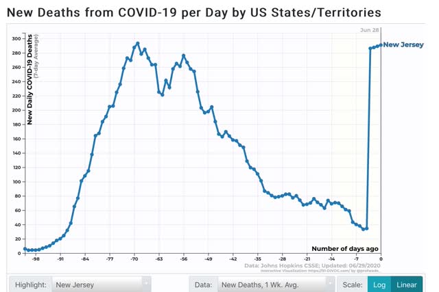
So, the below two graphs take the NYC metro area, including NJ, out of the data, and compare the remaining 47 States plus DC.
Here is the 7 day growth in new cases:
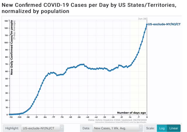
This looks very much like the exponential growth we were seeing back in March.
Now, here is the 7 day change in deaths:
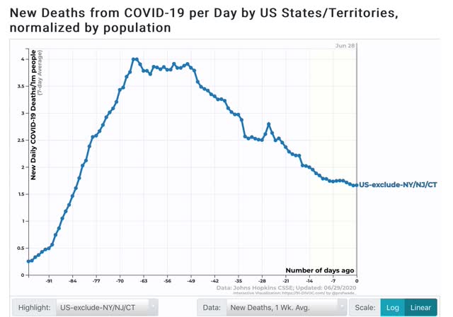
There has been a very slight decline over the past 10 days of the 7 day average.
The change in trajectory of deaths happened roughly one week after the new exponential growth in infections started. Because the young are not totally invulnerable from dying of the disease, I expect the death rate to slowly start rising, pretty much imminently.
One final note. How much did the Black Lives Matter protests affect new cases? Obviously social distancing went out the window, but the protests were outdoors and by all accounts almost all of the protesters wore masks. Since the protests started in Minnesota on May 25, 35 days ago, the effects ought to be apparent in cases by now.
So here is what Minnesota looks like:
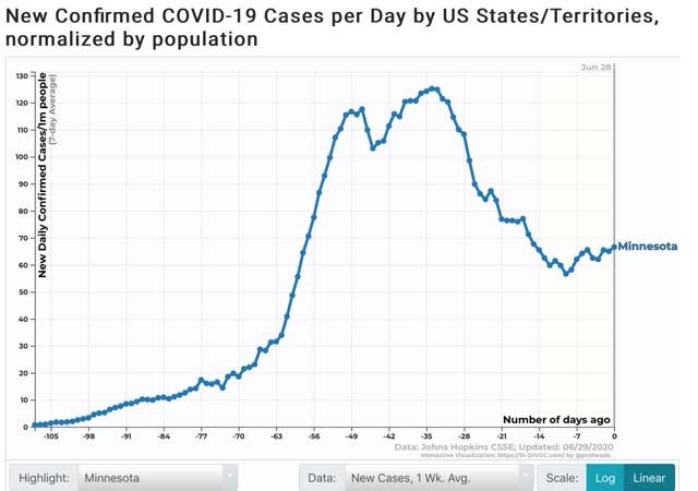
New infections continued to decline for 25 days, but have risen slightly in the past 10 days. This suggests, thankfully, that the protests will have little effect on the trajectory of new cases.