The chart of the decade Today doesn’t just mark the end of 2019, but the end of the 2010’s as well. So it’s only suitable that I post the one chart that I think most explains the economy over the past 10 years. In terms of public policy, that chart would be of the continual explosion of income and wealth inequality, particularly at the very top 0.1% or 0.01% of the distribution. But in terms of explaining why the economy has chugged along at roughly 2% GDP growth every year for 10 years, with no recession, the below graph, that was part of my year-end review last week, sums it up nicely. Here it is again, the YoY changes in the Fed funds rate and the YoY% change in the price of gas: What generally kills economic growth is either a sharp change in the cost
Topics:
NewDealdemocrat considers the following as important: Taxes/regulation, US/Global Economics
This could be interesting, too:
Joel Eissenberg writes How Tesla makes money
Angry Bear writes True pricing: effects on competition
Angry Bear writes The paradox of economic competition
Angry Bear writes USMAC Exempts Certain Items Coming out of Mexico and Canada
The chart of the decade
Today doesn’t just mark the end of 2019, but the end of the 2010’s as well. So it’s only suitable that I post the one chart that I think most explains the economy over the past 10 years.
In terms of public policy, that chart would be of the continual explosion of income and wealth inequality, particularly at the very top 0.1% or 0.01% of the distribution.
But in terms of explaining why the economy has chugged along at roughly 2% GDP growth every year for 10 years, with no recession, the below graph, that was part of my year-end review last week, sums it up nicely. Here it is again, the YoY changes in the Fed funds rate and the YoY% change in the price of gas:
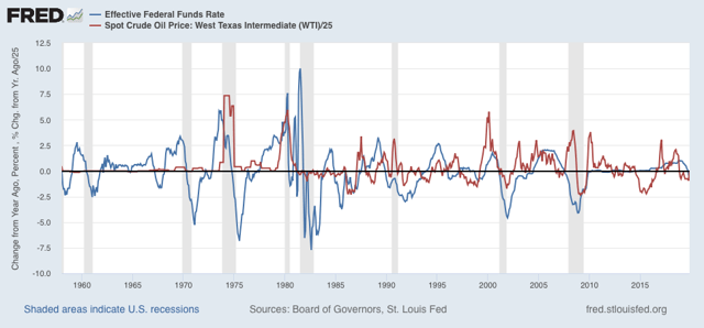
What generally kills economic growth is either a sharp change in the cost of financing and/or a sharp increase in the costs of inputs. In the 2010’s we never had either. In 2018 we came close, particularly in a YoY change in gas prices, but it was an increase from a very low level, and it didn’t last that long.
This very long moderation in both interest rates and important commodity prices is the most basic explanation for the fact that the expansion that started in 2009 is still going on as we begin 2020.
See you on the other side. In the meantime, Happy New Year!