Housing affordability update: prices vs. mortgage payments; and ramifications for the economy No economic news today (Monday 4/11), and most States didn’t report new COVID cases over the weekend, so let’s take a look at something else; namely, housing affordability, which I’ve been meaning to update for several weeks. The first graph below compares 4 measures of house prices: the FHFA purchase index, the Case Shiller national index, and the Census Bureau’s measures of median prices for new and all houses sold. The best way to get to the “real” inflation-adjusted cost of housing would be to divide by median household income, but since that is only officially calculated once a year, a good monthly proxy is average hourly wages, which is what I use
Topics:
NewDealdemocrat considers the following as important: House prices, mortgage payments, US EConomics
This could be interesting, too:
NewDealdemocrat writes JOLTS revisions from Yesterday’s Report
Bill Haskell writes The North American Automobile Industry Waits for Trump and the Gov. to Act
Bill Haskell writes Families Struggle Paying for Child Care While Working
Joel Eissenberg writes Time for Senate Dems to stand up against Trump/Musk
Housing affordability update: prices vs. mortgage payments; and ramifications for the economy
No economic news today (Monday 4/11), and most States didn’t report new COVID cases over the weekend, so let’s take a look at something else; namely, housing affordability, which I’ve been meaning to update for several weeks.
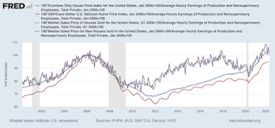
The first graph below compares 4 measures of house prices: the FHFA purchase index, the Case Shiller national index, and the Census Bureau’s measures of median prices for new and all houses sold. The best way to get to the “real” inflation-adjusted cost of housing would be to divide by median household income, but since that is only officially calculated once a year, a good monthly proxy is average hourly wages, which is what I use below. All 4 measures are normed to 100 as of January 2006, at or close to the peak of the housing bubble for all of them:

You can see that all 4 are at, close to, or even higher than they were at their bubble peaks. They range from 94.7% for Case Shiller to 104.9% for median new home prices.
While the NAR doesn’t permit FRED to publish historical data on the median price for existing home sales, their most recent report for February lists that price as 357,300. The median in January 2006 was 217,400. That’s a 64% increase. Since average hourly wages have increased 65% in the same period, that means that the “real” price of existing homes now is virtually identical to what they were at the peak of the bubble.
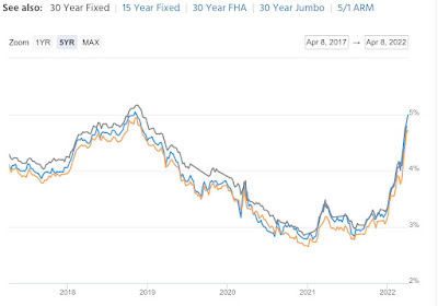
But if prices are equal to their bubble peaks, the story is different with mortgage rates. In 2006, they got as high as 6.8% in July, and were 6.51% in April. By contrast, the most recent weekly update pegs a 30 year fixed rate mortgage at 4.72%; the daily update has the rate at 5.08% – nearly tied for a 10 year high:

Since house prices in real terms are almost identical to their 2006 highs, let’s compare a $250,000 mortgage then and now at the prevailing mortgage rates. Here’s the monthly payment for each:
April 2006: $1865.
July 2006: $1913.
April 2022: $1583.
The bottom line is that the average monthly mortgage payment now is a little over 80% in real, wage-adjusted terms, of what it was at the peak of the bubble.
I do not expect prices and mortgage rate to continue to rise together, as they did up until the peak of the bubble. That’s because what made the bubble was the reckless “fog the mirror” mortgages, sold to just about anybody, bundled into phony “AAA-rated” mortgage bonds, and in turn sold to equally reckless “investors.”
Lending is much more responsible now. So if mortgage rates increase, I expect sales to tumble, followed in pretty quick succession by prices.
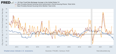
Let me close by updating one of my favorite housing graphs, comparing the YoY change in mortgage rates, (inverted, *10 for scale) with the YoY% change in housing permits and starts:

Mortgages are about 1.5% higher than they were a year ago, the biggest YoY change in 10 years. A 15% YoY decline in housing permits and starts would hardly be surprising, and a 10% decline seems almost certain. Such a decline will be a big negative for the economy going forward into 2023.
