– by New Deal democrat I’ll write about today’s ISM non-manufacturing report later, but first I wanted to follow up with several more graphs based on yesterday’s JOLTS labor report for April. Basically, I didn’t want to leave the impression that the labor market was in any way sub-par based on those numbers. With that in mind, below are two graphs. Both show the entire history of hires (red) and quits (gold) normed to 100 as of the yesterday’s report. Both show that, in raw numbers, only 2018-19 were stronger than even yesterday, let alone earlier in the post-pandemic recovery. In this first graph I also show the civilian labor force (number of people employed + unemployed) (blue), also normed to 100 as of yesterday. Where the blue line is
Topics:
NewDealdemocrat considers the following as important: hiring and quitting, Hot Topics, JOLTS, June 2024, US EConomics
This could be interesting, too:
NewDealdemocrat writes JOLTS revisions from Yesterday’s Report
Joel Eissenberg writes No Invading Allies Act
Bill Haskell writes The North American Automobile Industry Waits for Trump and the Gov. to Act
Bill Haskell writes Families Struggle Paying for Child Care While Working
– by New Deal democrat
I’ll write about today’s ISM non-manufacturing report later, but first I wanted to follow up with several more graphs based on yesterday’s JOLTS labor report for April. Basically, I didn’t want to leave the impression that the labor market was in any way sub-par based on those numbers.
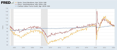
With that in mind, below are two graphs. Both show the entire history of hires (red) and quits (gold) normed to 100 as of the yesterday’s report. Both show that, in raw numbers, only 2018-19 were stronger than even yesterday, let alone earlier in the post-pandemic recovery.
In this first graph I also show the civilian labor force (number of people employed + unemployed) (blue), also normed to 100 as of yesterday. Where the blue line is lower than the red and yellow lines, the *rate* of persons being hired or voluntarily quitting is higher now. Where the blue line is higher, the current rate of hiring and quitting is lower:
As you can see, the current pace of voluntary quits remains higher than at any time except 2018-19 and the tail end of the 1990’s tech boom (when the data series began). Hires are kind of “meh” – not bad, but not good either.
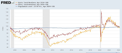
I’m not totally satisfied with that, because the strength of the jobs market also has an effect on people choosing to enter or leave it. So this second graph substitutes the prime age population, ages 25-54 (blue), again normed to 100 as of yesterday’s data:
As a share of the prime working age population, quits are as high as they ever were before the pandemic, and hiring was only better in 2000 and 2018-19.
In other words, this paints a picture of a labor market that has cooled from White Hot Boom levels to merely very, very good.
The Bonddad Blog
April JOLTS report: firming in hires, quits, and a (good) decline in layoffs, while “fictitious” job openings continue their slide, Angry Bear by New Deal democrat


