– by New Deal democrat The drought in new economic data continues through today. We’ll make up for it all at once tomorrow with jobless claims, retail sales, and industrial production. In the meantime, last week I noted that Hurricane Helene’s impact in Florida and North Carolina was a big part of the reason for the spike in initial claims. Let me follow that up further today. To begin with, State by State initial claims data is only available on a non-seasonally adjusted basis. So the best way to look is YoY. So all of the graphs below are presented in that format. To show the effect of hurricanes, what I have done in the past is subtract the data from the one or more States most affected by the event, and look at the YoY data for all of the
Topics:
NewDealdemocrat considers the following as important: US EConomics
This could be interesting, too:
NewDealdemocrat writes JOLTS revisions from Yesterday’s Report
Bill Haskell writes The North American Automobile Industry Waits for Trump and the Gov. to Act
Bill Haskell writes Families Struggle Paying for Child Care While Working
Joel Eissenberg writes Time for Senate Dems to stand up against Trump/Musk
– by New Deal democrat
The drought in new economic data continues through today. We’ll make up for it all at once tomorrow with jobless claims, retail sales, and industrial production.
In the meantime, last week I noted that Hurricane Helene’s impact in Florida and North Carolina was a big part of the reason for the spike in initial claims. Let me follow that up further today.
To begin with, State by State initial claims data is only available on a non-seasonally adjusted basis. So the best way to look is YoY. So all of the graphs below are presented in that format. To show the effect of hurricanes, what I have done in the past is subtract the data from the one or more States most affected by the event, and look at the YoY data for all of the rest of the States for the corrected nationwide picture ex-hurricane.
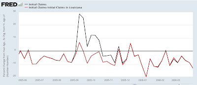
To begin with, here is Katrina in 2005, showing nationwide YoY claims (blue) vs. claims ex-Louisiana (red):
Including Louisiana, claims went up 30% and stayed elevate for five weeks thereafter, even as claims for the rest of the country were lower YoY.
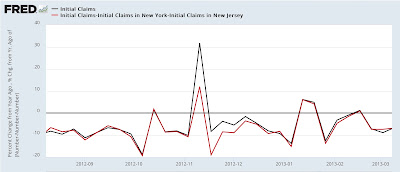
Here is Sandy:
Sandy’s effect on NY and NJ similarly caused a one-week spike to 30% higher YoY, and remained elevated compared with the remainder of the county for four more weeks.
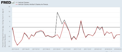
Here is Harvey, which impacted the Houston area in 2017:
Claims spiked higher by about 15%, and remained elevated compared with the remainder of the country for two more weeks.
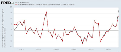
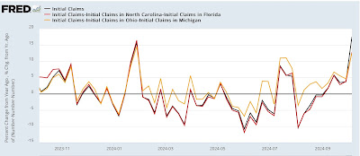
Now here is the situation as of last week, comparing the nationwide situation with that excluding Florida and North Carolina (gold), the two States most affected by Helene:
Nationwide claims were up 17.5% YoY. Excluding Florida and North Carolina, they were up 12.8% – still quite elevated.
As I mentioned last week, there were also spikes in Michigan and Ohio. I am not sure of the reason, but there may have been auto or transportation related strikes affecting those States. So the below graph shows the comparison excluding those two State in gold:
On that basis, claims were up 12.5% YoY.
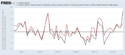
Now, let’s exclude all four States:
Claims were up 7.1%. This is still elevated, but is in line with the trend in the previous month, which as I have noted has been higher YoY, but not by nearly enough to set off recession alarm bells.
I suspect the Michigan and Ohio numbers will return to normal tomorrow (as always, we’ll see!). Based on the previous three episodes shown above, I also expect North Carolina’s spike to recede somewhat. Florida, of course, was hard hit by Milton last week, and so we can expect an even bigger spike there.
Finally, there was one other unusual factor in last week’s number.
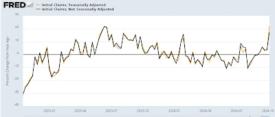
You would expect the YoY% comparisons for seasonal and non-seasonal data to be identical – since after all, a YoY comparison by definition takes out seasonality! But last week was one of those rare weeks where that wasn’t the case. The below graph shows the seasonally adjusted (gold) and non-seasonally adjusted (blue) YoY% changes for the past two years:
If you look at the far right, last week was one of the biggest variances in that entire time, as seasonally adjusted claims were up 22.3% vs. 17.5% for non-seasonally adjusted claims.
Typically these variances go away after one or two weeks, as in January 2023 and July of this year.
All of which is going to make tomorrow’s initial jobless claims report particularly fun, as all three factors – Helene receding, Milton crashing in, and the funky SA vs. NSA variance possibly being resolved – all will be in play.
The Bonddad Blog
Initial claims still positive, moving into very challenging YoY comparisons (plus a note about the PPI) – Angry Bear, by New Deal democrat

