Another well defined report by NDd about the possibility of recessions. Everything points in such a direction. If the Fed keeps raising its rate, it is almost a foregone conclusion. One a recession starts there is no backing away from it (as if we could). Scenes from the employment report: important leading and coincident indicators of recession – by New Deal democrat Here’s another detailed look at some significant data from last Friday’s employment report. In this post I’ll look at some leading and coincident indicators. First, about the unemployment rate. This is a lagging indicator coming out of recessions, but a leading one on the way in. While it is interesting that it declined -0.1% for the month, for forecasting purposes the YoY
Topics:
NewDealdemocrat considers the following as important: employment report, Hot Topics, July 2023, New Deal Democrat, US EConomics
This could be interesting, too:
NewDealdemocrat writes JOLTS revisions from Yesterday’s Report
Joel Eissenberg writes No Invading Allies Act
Bill Haskell writes The North American Automobile Industry Waits for Trump and the Gov. to Act
Bill Haskell writes Families Struggle Paying for Child Care While Working
Another well defined report by NDd about the possibility of recessions. Everything points in such a direction. If the Fed keeps raising its rate, it is almost a foregone conclusion. One a recession starts there is no backing away from it (as if we could).
Scenes from the employment report: important leading and coincident indicators of recession
– by New Deal democrat
Here’s another detailed look at some significant data from last Friday’s employment report. In this post I’ll look at some leading and coincident indicators.
First, about the unemployment rate. This is a lagging indicator coming out of recessions, but a leading one on the way in. While it is interesting that it declined -0.1% for the month, for forecasting purposes the YoY change is more important.
Here’s another look at the “jobless claims lead the unemployment rate” metric. The below graphs measure the YoY% change in jobless claims, averaged monthly, /10 for scale (blue). The red line is the change in the unemployment rate YoY, from which I subtract -0.1% for reasons I’ll explain after these first two graphs:
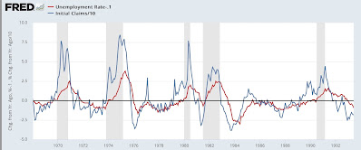
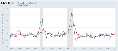
What these show is that, going back 50+ years, initial claims always turn higher YoY first, while the unemployment rate turns higher by +0.2% or more within 6 months before to 2 months after the onset of recessions. There are only two exceptions: one month in 1985, and the near “double-dip” of 2002.
Here is the same graph for the past 24 months:
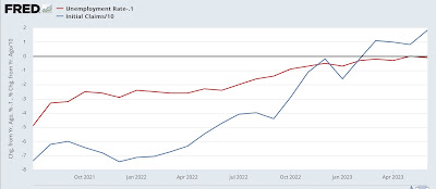
The unemployment rate was +0.1% higher YoY in May, and unchanged YoY in June. This is close to but not yet signaling the onset of a recession. But if jobless claims remain as elevated YoY in July and August as they were in June, that would almost certainly indicate that the unemployment rate trigger is shortly to follow.
Next, let’s take a look at two leading job sectors that haven’t quite turned yet, because of supply logjams in the Fed’s interest rate transmission mechanism.
Motor vehicle production had severe supply constraints all the way into 2022. As a result (not shown), only in the first half of this year did sales routinely meet or exceed 15 million on an annualized basis.
As a result, employment in vehicle manufacturing (blue in the graph below) has continued to increase sharply. Normally manufacturing employment (red) turns down well before a recession begins. But while it has flattened, it has not turned down:
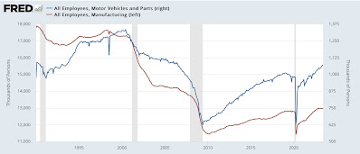
As shown above, vehicle manufacturing employment is about 5-8% of all manufacturing employment.
This next graph below compares total manufacturing employment, with manufacturing employment excluding motor vehicles (blue):
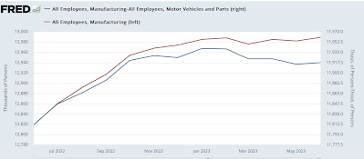
Ex-motor vehicles, manufacturing employment has indeed turned down since the beginning of this year.
There’s a similar situation in housing construction. The first graph below compares housing units under construction (red) with residential construction employment (blue). Unsurprisingly the former leads the latter:
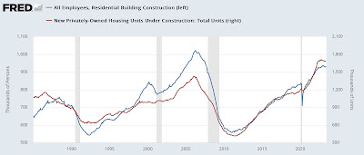
Since housing under construction is only down slightly from peak, residential construction employment has barely turned down at all.
Finally, let’s update one of my big coincident indicators of recession, the YoY% change in real aggregate payrolls. Below I’ve divided it into nominal payrolls (blue) vs. CPI (red), which hasn’t been reported yet for June:
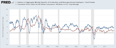
You can see that, going back 50+ years, whenever YoY inflation exceeds YoY nominal payroll growth, a recession is just beginning.
Here’s the same graph since the onset of the pandemic:
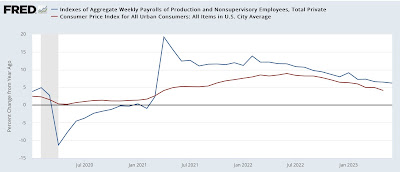
Nominal payroll growth, while decelerating, has done slightly more slowly than inflation, meaning that real aggregate payrolls have continued to increase. Meaning more buying power for average Americans.
An important issue is whether, with YoY comparisons now including gas prices that were declining from $5 (meaning they are less positive), the serendipitous comparison between payrolls and inflation will continue. And a big part of that issue is also, now that the supply bottlenecks in vehicle production and housing have abated, those two sectors of employment will finally roll over.
Scenes from the May employment report: leading indicators and the big picture, Angry Bear, New Deal democrat
