Real aggregate wage growth finally overtakes Reagan expansion In my opinion the best measure of how average Americans’ situations have improved during an economic expansion is real aggregate wage growth. This is calculated as follows: average wages per hour for nonsupervisory workers times aggregate hours worked in the economy deflated by the consumer price index This tells us how much more money average Americans are taking home compared with the worst point in the last recession. Let me give you a few examples why I believe that this is the best measure of labor market progress: First, compare an economy that creates 1 million 40 hour a week jobs at /hour, with an economy that creates 2 million jobs at 10 hours a week at /hour. If we were to count by
Topics:
NewDealdemocrat considers the following as important: Featured Stories, US/Global Economics
This could be interesting, too:
Ken Melvin writes A Developed Taste
Joel Eissenberg writes How Tesla makes money
Angry Bear writes True pricing: effects on competition
Angry Bear writes The paradox of economic competition
Real aggregate wage growth finally overtakes Reagan expansion
In my opinion the best measure of how average Americans’ situations have improved during an economic expansion is real aggregate wage growth. This is calculated as follows:
- average wages per hour for nonsupervisory workers
- times aggregate hours worked in the economy
- deflated by the consumer price index
This tells us how much more money average Americans are taking home compared with the worst point in the last recession.
Let me give you a few examples why I believe that this is the best measure of labor market progress:
First, compare an economy that creates 1 million 40 hour a week jobs at $10/hour, with an economy that creates 2 million jobs at 10 hours a week at $10/hour. If we were to count by job creation, the second economy would be better. But that’s clearly not the case. The second economy is paying out only half of the cold hard cash to workers as the first.
Next, let’s compare two economies that both create 1 million 40 hour a week jobs, but one pays $10/hour and the other pays $12/hour. Clearly the second economy is better. It is paying workers 20% more than the first.
Finally, let’s compare two economies that create 1 million 40 hour a week jobs at $10/hour. In the first economy, there are 3% annual raises, but inflation is rising 4%. In the second, there are 2% annual raises, but inflation is rising 1%. Again, even though the second economy is giving less raises, it is the better one — those workers are seeing their lot improve in real, inflation-adjusted terms, whereas the workers in the first economy are actually losing ground.
In each case, the economy creating more jobs, or more hourly employment, is inferior to the economy that pays more in real wages to its workers, In other words, the best measure of a labor market recovery is that economy which doles out the biggest increase in real aggregate wages.
In short, people work for the cold hard cash that is put in their pockets, and real aggregate wage growth measures how much more of that they’ve received.
With that introduction, here is an updated graph of real aggregate wages for the entire past 53 years:
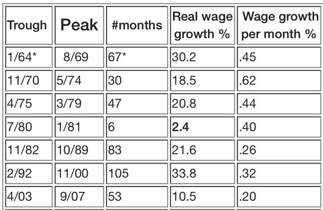
So how does the current expansion compare with past ones? Here is a chart I created several years ago showing the real aggregate wage growth in every prior economic expansion beginning with 1964:
* start of series
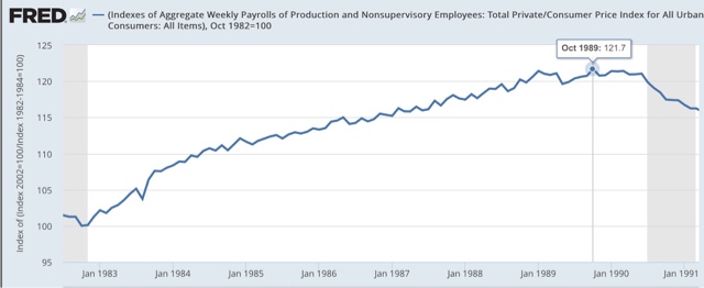
And here is the graph showing the Reagan-Bush economy of th 1980s. As indicated above, at their peak nearly 7 years after the expansion in wages started, they peaked at growth of +21.6%
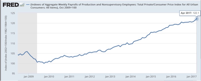
The most recent trough for aggregate real wages after the last recession was in October 2009. We are now 90 months later, and with the strong job reports of the last few months, real wages have now grown 22.1%:
The present expansion is now only behind the 1960s and 1990s for the best recovery in real aggregate wages in the last half century.
Where this expansion has lagged has been the velocity of wage growth. Even with the recent spurt, the monthly average real aggregate wage growth has only been 0.25%, slightly behind the Reagan era’s 0.26%, and only ahead of George W. Bush’s 0.20%.
Since the 1970s, only in the late 1990s has real wage growth monthly been over 0.30%. I believe this is because of the disappearance of unions, which gave labor bargaining power, which in the 1990s was overcome because of the length and strentgth of the tech boom itself, the only period of prolonged labor market tightness in the last 40 years.
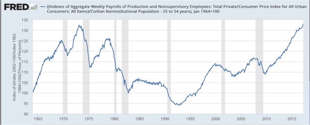
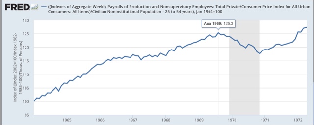
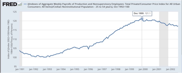
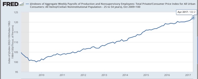
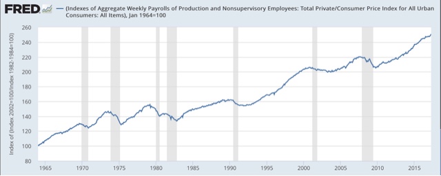
UPDATE: One important modification that can be made to the above data is to adjust for the growth (or lack thereof in the case of the last 10 years in the prime working age 25-54 population. This gives us real wage growth per capita for the target demographic.
Here’s what that looks like over the entire last 53 years:
It’s pretty clear that since the 1970s, only the 1990s and the present expansion showed any significant growth at all.
For comparison purposes, here are the 1960s beginning in 1964:
and the 1990s:
and the present:
Measured per capita among the prime working age demographic, the current expansion is slightly better than the 1990s, but lags well behind the 1960s — but leaves the Reagan expansion in the dust.

