Summary:
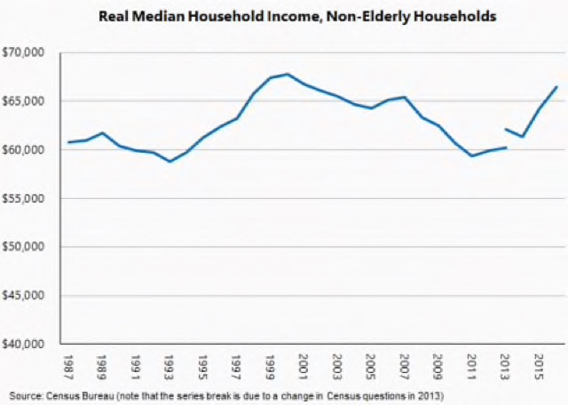
The asterisk in real median household income This is a follow-up to the post I wrote last week about the latest data on real median household income. One of the things I notes is that “households” includes the millions that are composed of retirees, a burgeoning demographic due both to healthier longevities and the demographics of the Boomer generation. This morning Jared Bernstein helpfully includes a graph of real median household income excluding those over age 65: Households headed by working age adults did finally surpass their 2007 income, but were still 3.4% below the all-time highs of incomes of 2000. But mainly I wanted to follow up on that break in the graph in 2013. It was caused by a change in methodology by the Census Bureau.
Topics:
NewDealdemocrat considers the following as important: Featured Stories, Taxes/regulation, US/Global Economics
This could be interesting, too:
Ken Melvin writes A Developed Taste
Joel Eissenberg writes How Tesla makes money
Angry Bear writes True pricing: effects on competition
Angry Bear writes The paradox of economic competition
The asterisk in real median household income
This is a follow-up to the post I wrote last week about the latest data on real median household income.
One of the things I notes is that “households” includes the millions that are composed of retirees, a burgeoning demographic due both to healthier longevities and the demographics of the Boomer generation.
This morning Jared Bernstein helpfully includes a graph of real median household income excluding those over age 65:
Households headed by working age adults did finally surpass their 2007 income, but were still 3.4% below the all-time highs of incomes of 2000.
But mainly I wanted to follow up on that break in the graph in 2013. It was caused by a change in methodology by the Census Bureau.
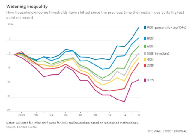
Here’s the graph I ran last week of real median household incomes at various quintiles and deciles:
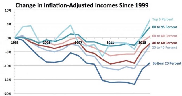
So I was surprised a few days later to see another, more pessimistic graph floating around, purporting to show that only the top 20% of households had higher incomes than in 2000:
Note that this graph doesn’t have any break.
I traced the information back to its source, which turned out to be the Economic Policy Institute. And at the bottom of their article, I found a footnote explaining thus:
In other words, as best I can tell the E.P.I. simply took the 3.2% difference in the two methodologies in 2013 and projected it forward.
Now, let me state right up front that I don’t know whether the data as represented by E.P.I. is correct or not.
But, neither does the E.P.I.
In fact, neither does anybody else, apparently including the Census Bureau itself.
That’s because the Census Bureau hasn’t provided data in any year since 2013 as to what the numbers would have been under their old methodology, so that we can form a basis of comparison.
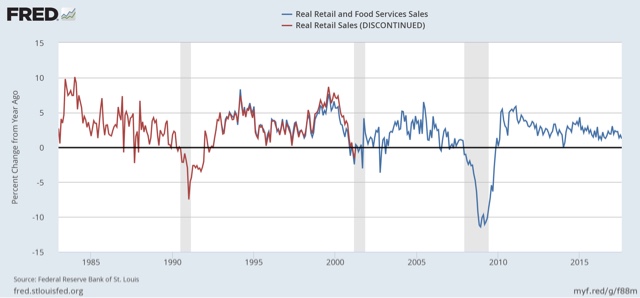
By contrast, when the methodology for “real retail sales” was updated in the 1990s, the old data series continued to run for nearly 10 years, giving us an excellent basis for comparison, and confirming that the YoY changes were virtually identical, meaning that we can stitch the two series together confidently, giving us 70 years worth of data:
The Census Bureau didn’t do that with real median household income, so there will *always* be a disconnect and a lack of ability to reliably and directly compare data from before 2013 with data afterward. We’ll always be guessing.
This is a major problem for this important data series, and the Census Bureau should take steps, to the extent possible, to correct it.


