Abbreviated coronavirus dashboard for April 29: actual good news on testing,deaths Here is the update through yesterday (April 28). This is somewhat abbreviated since I want to post about a couple of other items. As usual, new items of significance are in italics. Yesterday was the 3rd day in a row of not just significantly increased testing, but actual lower number of infections found by that testing – a very good sign. The 7 day average of deaths also moved into significant decline. At least those States which are sticking with a “crush the curve” strategy appear to be turning the corner. Here are yesterday’s numbers. Number and rate of increase of Reported Infections (from Johns Hopkins via arcgis.com) Number: up +24,114 to 1,012,583 (vs. day/day
Topics:
NewDealdemocrat considers the following as important: Healthcare, Uncategorized
This could be interesting, too:
tom writes The Ukraine war and Europe’s deepening march of folly
Stavros Mavroudeas writes CfP of Marxist Macroeconomic Modelling workgroup – 18th WAPE Forum, Istanbul August 6-8, 2025
Lars Pålsson Syll writes The pretence-of-knowledge syndrome
Bill Haskell writes Families Struggle Paying for Child Care While Working
Abbreviated coronavirus dashboard for April 29: actual good news on testing,deaths
As usual, new items of significance are in italics. Yesterday was the 3rd day in a row of not just significantly increased testing, but actual lower number of infections found by that testing – a very good sign. The 7 day average of deaths also moved into significant decline. At least those States which are sticking with a “crush the curve” strategy appear to be turning the corner.
Here are yesterday’s numbers.
-
- Number: up +24,114 to 1,012,583 (vs. day/day high of +36,161 on April 24)
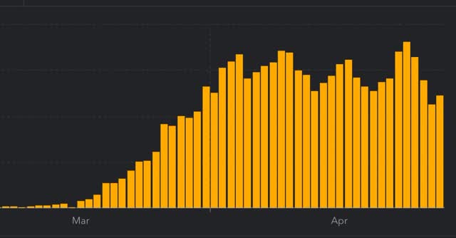 Figure 1
- ***US Rate of increase: day/day: 2% (vs. 3% for the past week and 2% on April 27
The trend seems to be a slight decrease in the number of new cases.
Number of deaths and infections and rate of increase of testing (from COVID Tracking Project)
- ***Number of deaths: Total 52,525, increase of +2,197 day/day
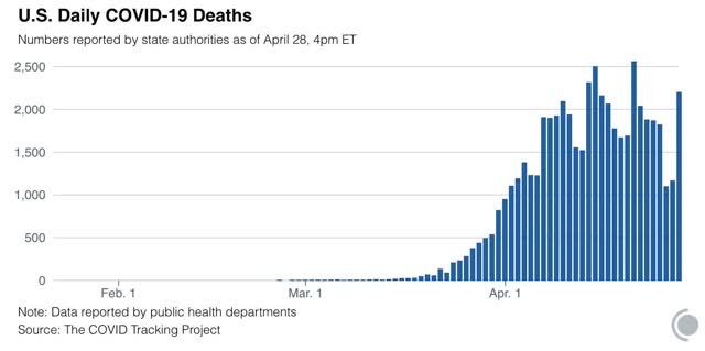
- Seven day average of deaths: 1,722 vs. 2,058 peak on April 21 (this is important because many fewer deaths are recorded by the States over the weekend, and there is a jump in reports on Tuesdays.
- Rate: increase of 4% day/day vs. average of 4% in past week
- Number of tests: 200,233 (vs. 300,833 daily peak on April 25*)**
- Ratio of positive tests to total: 8.3:1 (vs. 8.7 on April 27)
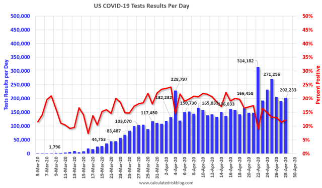
NOTE that in the past two weeks, as shown in the graph above, the percentage of positive to total tests has declined from about 20% to 12% in a fairly straight line. That’s an average of 4% a week. If this should continue, within two weeks that percentage will be down to 5% or below. That translates into a ratio of better than 15:1 total to positive tests, and is my threshold, based on the history of South Korea, when lockdowns can begin to be judiciously lifted and a regimen of “test, trace, and isolate” can be begun. *ex.-Calif clearing its backlog
Summary for April 29
- The total US population remains under total lockdown has declined substantially due mainly to the renegade States in the Confederacy.
- The number of daily new infections, adjusted for testing, appears to have peaked one to two weeks ago.
- The number of daily new deaths also appears to have peaked about one week ago.
- The trend number of daily tests has improved dramatically in the past 6 days from an average of about 150,000-160,000 to about 220,,000. Better still, for the last 3 days, new infections have declined, even with higher testing – a very positive, if preliminary, sign.
- My personal suspicion remains that the actual number of total infections in the US is about 5x the official number, or roughly 5 million at present.
- Going forward, it will probably be important to separate out those States which are “opening up” without sufficient testing or precautions, which I expect to see a new wave of infections, vs. States which want to drive the number of new infections close enough to zero to follow an intensive “test, trace, and isolate” approach. As indicated above, those States may be within 2 weeks of being able to implement that regimen.