Coronavirus dashboard for June 17: big progress since 1 year ago; big “Delta” challenge still ahead One year ago today, in my Coronavirus Dashboard for June 17, here was my graph of cases Which I described as: As shown in the graph above, [after Arizona at 214 per million population] the remaining “top 10” are all States in the Confederacy, High Plains, and Mountain West. In order, (showing rates of new infections per million as of June 15 in parentheses) they are: Alabama (156), Arkansas (150), South Carolina (125), Louisiana (127), North Carolina (117), Utah (102), Mississippi (98), Florida (83), and Iowa (83). One year later, the scale of the current pandemic is an order or more of magnitude lower. But the regions with the worst
Topics:
NewDealdemocrat considers the following as important: coronavirus and politics, coronavirus dashboard, Healthcare, US EConomics, US/Global Economics
This could be interesting, too:
NewDealdemocrat writes JOLTS revisions from Yesterday’s Report
Bill Haskell writes The North American Automobile Industry Waits for Trump and the Gov. to Act
Bill Haskell writes Families Struggle Paying for Child Care While Working
Joel Eissenberg writes Time for Senate Dems to stand up against Trump/Musk
Coronavirus dashboard for June 17: big progress since 1 year ago; big “Delta” challenge still ahead
One year ago today, in my Coronavirus Dashboard for June 17, here was my graph of cases
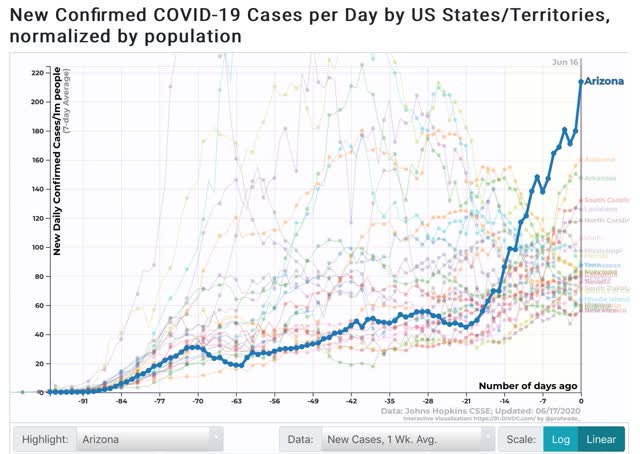
Which I described as:
As shown in the graph above, [after Arizona at 214 per million population] the remaining “top 10” are all States in the Confederacy, High Plains, and Mountain West. In order, (showing rates of new infections per million as of June 15 in parentheses) they are: Alabama (156), Arkansas (150), South Carolina (125), Louisiana (127), North Carolina (117), Utah (102), Mississippi (98), Florida (83), and Iowa (83).
One year later, the scale of the current pandemic is an order or more of magnitude lower. But the regions with the worst outbreaks remain the same (sadly, ingrained behavior patterns are incredibly resistant to change).
Let’s begin the current situation with CNN’s graph of vaccination rates in the 50 States plus DC and PR:
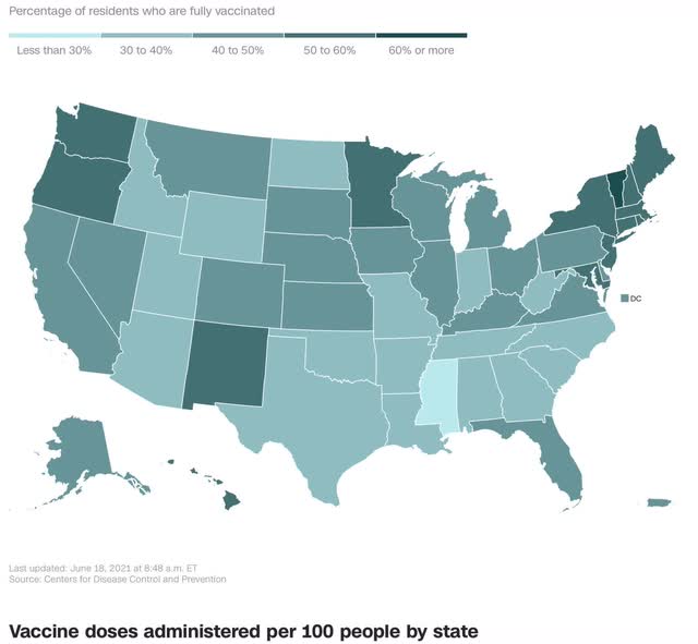
The regional disparities are completely obvious. While in the US as a whole, 96 doses have been administered per 100 population, the range varies from Vermont at close to 140 doses to Mississippi at about 62 doses. Basically in Mississippi plus all of the other States less than 40% fully vaccinated remain at risk for a renewed outbreak of the virus at any time.
Here is the US situation as to the 7 day average of both new cases and deaths:
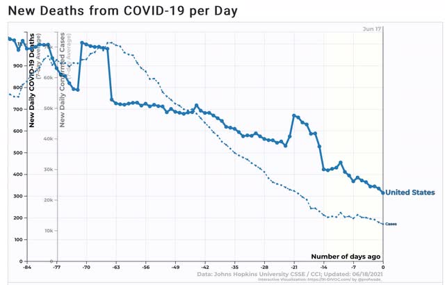
Progress on new cases has slowed considerably, while deaths, which lag by about 4 weeks, are still declining. Deaths will probably follow cases to a near halt in the decline at about 300 deaths per day.
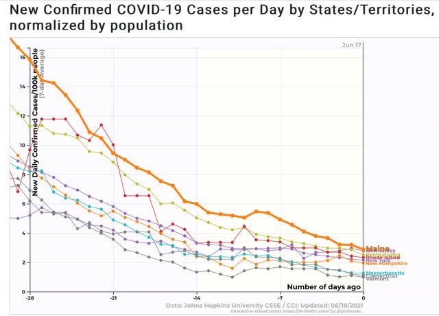
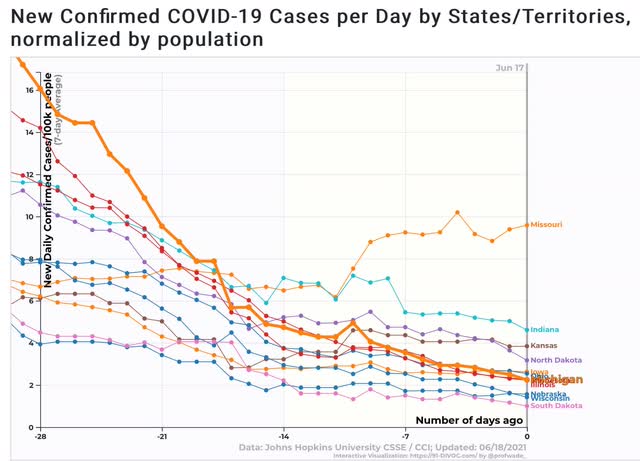
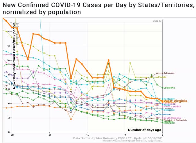
Because of the regional differences, below are new cases for each of the four US regions.
Northeast:
Midwest:
South (including DE, MD, DC, and VA):
And West: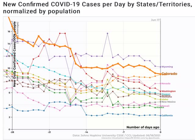
Let’s break the above down by ranges of new cases [NOTE: since 1 year ago 91-DIVOC was measuring per 1 million, and now they measure by 100,000, current rates must be multiplied by 10 to compare with the graph from 1 year ago]:
Under 2 per 100,000: VT, SD, CT, MA, MD, WI, NE, VA, DC, PR, NH, SC
2 to 4 per 100,000: NY, IL, CA, MI, MN, RI, TN, PA, OH, IA, NJ, ME, DE, ND, GA, AK, NC, TX, HI, KS, MS
4 to 6 per 100,000: OK, AL, NM, WV, KY, IN, ID, MT, AZ, OR
6 to 8 per 100,000: LA, WA, NV, FL
8 to 10 per 100,000: AR, UT, CO, MO
Over 10 per 100,000: WY
While new cases do not closely track the vaccination rate, the correlation remains obvious, as the best States are all of the Northeast (under 3 cases per 100,000) plus the Mid-Atlantic (DE, MD, DC, and VA), upper Midwest, and California. The worst States are in the Deep South and West, plus Missouri. But there are surprises, like SD and SC doing very well, while WA and CO are doing relatively poorly.
As the “Delta” variant becomes more widespread in the next 4 to 8 weeks, it will be a real challenge for the relatively unvaccinated States. At the same time, all but 12 of the States are currently below even the lowest level of new infections one year ago, and Wyoming’s now is only about 1/2 of Arizona’s last summer at this time – although it would have been in the top 10.