Scenes from the March employment report 2: unemployment recession indicators – by New Deal democrat A reminder: I may be offline for the next couple of days. In the meantime, yesterday I looked at the 5 leading indicators contained in the employment report, and summarized how they either signal recession now or within the next 3 to 6 months. Today I want to focus on unemployment and underemployment. Economist Gloria Sahm’s Rule, namely that when the 3-month average unemployment rate rises a half percentage point above the low of the prior 12 months, the economy is in recession, or is about to be, is sufficient to indicate the onset of a recession, but is not necessary. Recessions in the past have started with even a 0.1% increase. So,
Topics:
NewDealdemocrat considers the following as important: Education, politics, recession indicators, Unemployment, US EConomics
This could be interesting, too:
Robert Skidelsky writes Lord Skidelsky to ask His Majesty’s Government what is their policy with regard to the Ukraine war following the new policy of the government of the United States of America.
NewDealdemocrat writes JOLTS revisions from Yesterday’s Report
Joel Eissenberg writes No Invading Allies Act
Ken Melvin writes A Developed Taste
Scenes from the March employment report 2: unemployment recession indicators
– by New Deal democrat
A reminder: I may be offline for the next couple of days. In the meantime, yesterday I looked at the 5 leading indicators contained in the employment report, and summarized how they either signal recession now or within the next 3 to 6 months.
Today I want to focus on unemployment and underemployment. Economist Gloria Sahm’s Rule, namely that when the 3-month average unemployment rate rises a half percentage point above the low of the prior 12 months, the economy is in recession, or is about to be, is sufficient to indicate the onset of a recession, but is not necessary. Recessions in the past have started with even a 0.1% increase.
So, let’s look at some indicators which give us quicker signals.
1. Initial jobless claims lead the unemployment rate
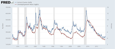
This is something I have written and updated numerous times in the past decade. Initial jobless claims are one of the 10 items in the Index of Leading Indicators, and as shown below, have a 50+ year track record of turning both higher and lower before the unemployment rate does:
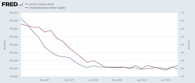
Here is the update for the past two years:
The relationship shows up even better when we compare the YoY% change in both up until the pandemic (note this means a % of a % in the case of the unemployment rate, so an increase from 4% to 8% would be a 100% increase):
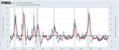
Usually, but not always, the unemployment rate has been higher YoY by the time a recession begins.
Here is the YoY update for the past two years:
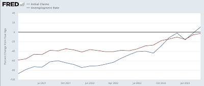
In March, initial claims finally did turn higher YoY, and the unemployment rate is on track to do so as well within the next several months. As I’ve indicated a number of times in the past year, my “red flag” marker is initial claims, on a monthly basis, being 12.5% higher for two months in a row. We’re not quite there yet.
2. Permanent job losers
This series began in 1994, so we only have about a 30 year history. But it does seem to be a good marker for weakness in the job market, as shown below measured 2 ways: its absolute level (blue), and YoY% change (red):
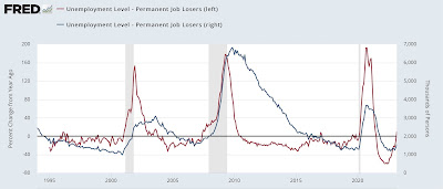
While there have been several brief false positives, notably 1996, where the 3 month trend is higher YoY, it has usually meant a recession is near.
There is a similar series of total job losers that goes all the way back to 1967. Here’s what that looks like YoY (blue) compared with the newer, permanent job losers series (red):
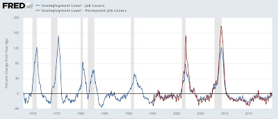
With the noted exceptions of 1974 and 1981, the older series has also turned higher YoY prior to all other recessions.
Here is a close-up of the past 2 years:
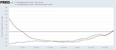
These metrics – as well as initial claims, discussed above – have just hoisted a yellow flag. If next month’s report is also higher YoY, that would merit a red flag, indicating a recession is very close, perhaps imminent.
March jobs report: leading sectors turn down, pre-recessionary report still quite positive, Angry Bear, New Deal democrat.
