My colleague Chris Magee sent this graphs around about employment losses during different recessions. The first one below show all the recession from the 1970s onwards. The next one, which I modified to show just the Great Recession and the Great Depression, is below, and gives a sense of the dimension of the Depression. The sheer size of the Depression is impressive. Even though the last recession is an outlier, it pales in comparison with the Great Depression. You can see in the graph very clearly the Roosevelt recession of 1937-38, and also the fact that the recovery was very slow, even though as one can see from the graph above the current recovery was also slow, by historical standards.I'm not sure what lessons Chris derived from his graphs, but I would argue that is safe to say
Topics:
Matias Vernengo considers the following as important: Chris Magee, Employment, Great Depression, Great Recession, Josh Bivens
This could be interesting, too:
Ken Houghton writes Just Learn to Code
Merijn T. Knibbe writes Employment growth in Europe. Stark differences.
NewDealdemocrat writes In-depth look at the leading indicators from the employment report
NewDealdemocrat writes One more time: bifurcation in the jobs report, as Establishment Survey shows continued jobs growth, while Household Survey comes close to triggering the “Sahm Rule”

The next one, which I modified to show just the Great Recession and the Great Depression, is below, and gives a sense of the dimension of the Depression.
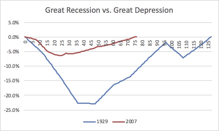
The sheer size of the Depression is impressive. Even though the last recession is an outlier, it pales in comparison with the Great Depression. You can see in the graph very clearly the Roosevelt recession of 1937-38, and also the fact that the recovery was very slow, even though as one can see from the graph above the current recovery was also slow, by historical standards.
I'm not sure what lessons Chris derived from his graphs, but I would argue that is safe to say that both the macro interventions, the fiscal package and the alternative monetary policy(even if one might have criticisms about particular elements of both), and the more widespread existence of automatic stabilizers, worked very well and precluded another Great Depression. I would see that as some evidence in favor of the New Deal policies and institutions, which essentially were behind the macro policies, and of the importance of Keynesian ideas, which gave theoretical foundation to those policies.
Josh Bivens had a piece on EPI a few years back on the slow recovery which is still worth reading. Btw, his lessons seems to be that there was not enough fiscal stimulus, something that also explains to some degree the persistence of the Depression. I wrote, even longer ago, that one should also take into consideration the conditions of the labor market, and not just the employment recovery, to have a better picture of the economic conditions.
PS: I have done a similar graph with GDP losses comparing the US and Greece. That one indicates the costs of austerity (in Greece).