The figure below, from a recent piece in the Wall Street Journal, shows the catching up of the South. Note that most occurs after the New Deal, and up to the 1980s. The piece emphasizes the reversal, with divergence since the last recession. This suggests that the New Deal and the period in which the segregationist policies were eliminated were a period of prosperity for the South. The catching up story is one associated mostly to State action, since the New Deal in many ways was a sort of Marshall Plan for the South (think TVA), even though the WSJ piece emphasizes policies, like lower taxes, and the lack of unions. And there is a lot to discuss there.But what surprised me by looking at the graph, and the story I think is more interesting, is the apparent relative decline of the West.
Topics:
Matias Vernengo considers the following as important: Argentina, Catch up, Divergence, Innovation, Silicon Valley
This could be interesting, too:
Matias Vernengo writes Milei and real wages in Argentina
Joel Eissenberg writes Javier Milei: Argentina’s Trump?
Merijn T. Knibbe writes Superinflation in Milei´s Argentina
Merijn T. Knibbe writes ´Fryslan boppe´. An in-depth inspirational analysis of work rewarded with the 2024 Riksbank prize in economic sciences.
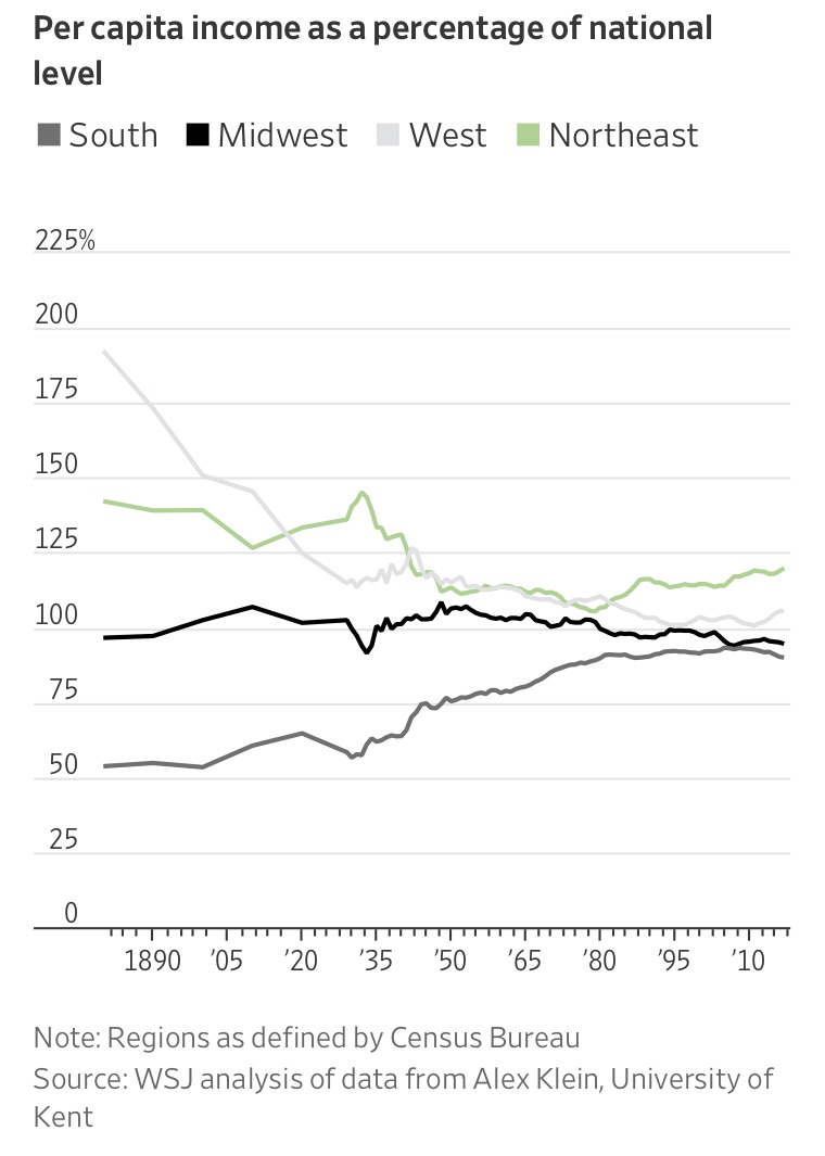
The catching up story is one associated mostly to State action, since the New Deal in many ways was a sort of Marshall Plan for the South (think TVA), even though the WSJ piece emphasizes policies, like lower taxes, and the lack of unions. And there is a lot to discuss there.
But what surprised me by looking at the graph, and the story I think is more interesting, is the apparent relative decline of the West. The story, like that of Argentina, for example, is one of persistent decline over the whole 20th century. And that's obviously not what you would imagine about the West, that went from a backwater, essentially rich in natural resources (e.g. Gold Rush), to a prosperous region with the most dynamic innovation hubs in the US (Silicon Valley).
So the continuous decline of income per capita in the West is NOT a story of persistent decline. In many ways it is exactly the opposite of that. You start with very low levels of population and income, and an accident, associated to the existence of high value natural resources leads to an economic boom. Gold, oil and other minerals in the case of the West, and in some parts high agricultural productivity. Income per capita shoots fast up, and by the time of the graph you have that it is way above the US average. Which explains the heavy inflow of immigrants, which in turn explains, as the population in the West as a share of total US population increases, the decline in income per capita.
But that process goes hand in hand with the development of sophisticated manufacturing in the West, from aeronautics and aviation to computer and information industries. In this case, the story of lower income per capita with respect to the country is not a history of decline, and the early history, in spite of the high income per capita suggests a relatively unsophisticated economy. That's an important analogy when you think of cases like Argentina.