Friday , March 29 2024
Home / Tag Archives: coronavirus dashboard (page 3)

Tag Archives: coronavirus dashboard

Coronavirus dashboard for August 25: is the Delta wave close to peaking?

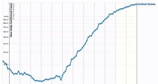
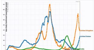
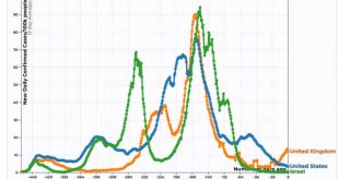
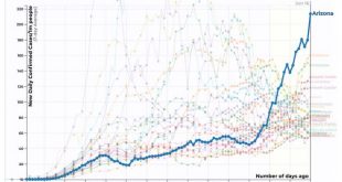
Coronavirus dashboard for August 25: is the Delta wave close to peaking? I’ve been writing for about a month that, if the US outbreak followed the cycle of India and the UK, in which the Delta wave hit its peak about 6 to 8 weeks after onset, in the US the peak would be about Labor Day. As the graph below (which is in log scale better to show accelerating and decelerating trends) shows, it looks like that is about to happen: For the US as a...

Read More »

I see reason for optimism

Coronavirus dashboard for August 4: in which I see reason for optimism by New Deal democrat   It seems pretty clear that Delta burns through the dry tinder very fast – on the order of 9 to 12 weeks from onset to peak, based on the experience of the UK and India, respectively. The US is 7 weeks past its trough in cases, so it is a fair hypothesis that the Delta wave will reach its peak at some point in the next 2 to 5 weeks – roughly at some...

Read More »

Coronavirus dashboard for June 28: comparisons with one year ago as “delta” spreads

Coronavirus dashboard for June 28: comparisons with one year ago as “delta” spreads Let’s begin this installment with a look at vaccinations by county from a different source that a reader pointed me to last week, COVIDactnow:  The urban/rural and Red State/Blue State divides are pretty obvious. Conor Kelly (whose work I was highlighting one year ago) also has a more detailed breakdown: He notes that income level also...

Read More »

Coronavirus dashboard for June 21: watching the States with flat or increasing rates of new cases

Coronavirus dashboard for June 21: watching the States with flat or increasing rates of new cases For the past week I have been sounding the alarm about the economic impact of the “delta” variant of COVID. We are probably already beginning to see its impact on the case count in several States, with many more primed to join the pack, so that is what I want to focus on today. To begin with, let’s compare the 3 countries that have had the most...

Read More »

Coronavirus dashboard for June 17: big progress since 1 year ago; big “Delta” challenge still ahead

Coronavirus dashboard for June 17: big progress since 1 year ago; big “Delta” challenge still ahead One year ago today, in my Coronavirus Dashboard for June 17, here was my graph of cases Which I described as: As shown in the graph above, [after Arizona at 214 per million population] the remaining “top 10” are all States in the Confederacy, High Plains, and Mountain West. In order, (showing rates of new infections per million as of June...

Read More »

Coronavirus dashboard for June 9: the high correlation between partisan lean, vaccination rates, and new cases

Coronavirus dashboard for June 9: the high correlation between partisan lean, vaccination rates, and new cases No big economic news today, so I wanted to follow up on Monday’s post, in which I described the correlation between the number of new COVID cases and States in which there were high vaccination rates vs. ones with low rates. The both sad and maddening point is, vaccination rates correlate strongly with partisan lean, and so do the present...

Read More »

Coronavirus dashboard for June 7: a Tale of Two Pandemics: the Vaccinated States vs. the Idiotic States

Coronavirus dashboard for June 7: a Tale of Two Pandemics: the Vaccinated States vs. the Idiotic States The drive towards “herd immunity” via vaccination has slowed to a crawl. The slowing is almost entirely driven by Trump-voting States in the South and West. Those Idiotic States are continuing to suffer from an ongoing pandemic, while in the Biden-voting States of the Northeast, Midwest, and California, the pandemic has all but ended.Here...

Read More »

Coronavirus dashboard for June 2: most of US approaches herd immunity threshold; COVID still spreading among the remaining idiots

Coronavirus dashboard for June 2: most of US approaches herd immunity threshold; COVID still spreading among the remaining idiots In the past week new COVID-19 cases declined almost 30%, by about 7,000 to 17,289/day; however, deaths actually increased by about 10% to an average of 589/day, mainly due to a data dump by California 5 and 6 days ago – thus I expect a new low in deaths within the next several days: Figure 1 Total deaths are...

Read More »

Coronavirus dashboard for May 24: 3 weeks to “0” new cases?

Coronavirus dashboard for May 24: 3 weeks to 0 new cases? No, that won’t happen. But, even so, that is the current trajectory. Let’s start with the overview:Total *confirmed* cases: 33,117,737Total deaths: 589,893 Note that there are many more cases that we don’t know about because the people were never tested. Since about half of cases appear to be only mildly or non-symptomatic, an additional 10% of the population having been infected seems...

Read More »

Coronavirus dashboard: entering the home stretch?

Coronavirus dashboard: entering the home stretch? G*d willing, I will only feel the need to update this information for another month or two. The US is simply making great progress on all fronts, and there are no new outbreaks in any of the States. Close to 40% of the entire US population is totally vaccinated, and almost 50% has received at least one dose: As a result, both cases and deaths are lower than their troughs last summer,...

Read More »