Friday , April 19 2024
Home / Tag Archives: coronavirus dashboard (page 2)

Tag Archives: coronavirus dashboard

BA.2 wave

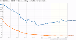
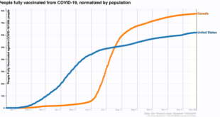
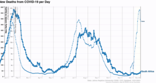
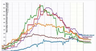
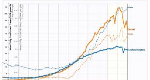
Coronavirus dashboard for March 28: I’ll take the “under” for the severity of any BA.2 wave Very few US States reported over the weekend. The decline in new cases has stalled at roughly 30,000 per day. Deaths are still declining, and are currently just below 800 per day. Since the BA.2 variant continues to generate new headlines, with just about everybody warning of a new wave in the US, let’s take a look at what actually happened in Europe...

Read More »

Coronavirus dashboard for March 18: the BA.2 variant behaves just like original Omicron

Coronavirus dashboard for March 18: the BA.2 variant behaves just like original Omicron In the last several days, the 7 day average of cases in the US has increased slightly from  30,700 to 32,700. The rate of decline w/w has decelerated to only 10%. Meanwhile, deaths have finally declined to slightly below 1000 at 995. The number of jurisdictions where cases increased week over week has increased to 7 or so in the past several days, compare...

Read More »

With seasonality over, it is clear that Omicron is responsible for increased layoffs

With seasonality over, it is clear that Omicron is responsible for increased layoffs With seasonality behind us, it is apparent that Omicron has resulted in increased layoffs. New claims declined 30,000 last week to 260,000 – still well above its pandemic low of 188,000 set early in December. The 4 week average of new claims increased 15,000 to 247,000: Continuing claims for jobless benefits rose for the second week in a row, by...

Read More »

How “mild” Omicron is depends upon how much you lag the data

Coronavirus dashboard for January 10: how “mild” Omicron is depends upon how much you lag the data So, how “mild” or not, is Omicron? It depends on whether you lag the data on hospitalizations and deaths or not.The original story out of South Africa was that Omicron was extremely mild. Despite a huge spike in infections, deaths barely budged. As Omicron took hold in Europe and the US, South Africa disappeared from the picture.  Which is too...

Read More »

Where we are now, and where we are probably going

Coronavirus dashboard for year-end 2021: the Graph of the Year, where we are now, and where we are probably going At the end of the 2nd year of the pandemic, a little self-assessment of what I got right and wrong, where we are and where we are probably going. The one thing I got wrong in a big way is explained by this Coronavirus Graph of the Year: I thought sure that once the effectiveness of the vaccines was widely known, opposition...

Read More »

Coronavirus dashboard for December 21: exponential spread is here

Coronavirus dashboard for December 21: exponential spread is here  As I warned you on Saturday, there might be some hooky-playing this week; and as I also said, that was “Omicron permitting.” Well, Omicron warrants an update today. Because exponential spread is underway especially in those parts of the country most exposed to international visitors. But first, in the spirit of leading indicators, let’s take a look at South Africa, where...

Read More »

The Biden Administration had better come up with a ‘Plan B’

Coronavirus dashboard for December 7: since further mass vaccination could only happen at gunpoint, the Biden Administration had better come up with a ‘Plan B, New Deal democrat No significant economic news today, so let’s catch up a little bit with Covid. There are still distortions in the 7 day average data, as States did data dumps of deaths and new cases throughout last week, after not reporting over the long Thanksgiving holiday. That...

Read More »

Coronavirus dashboard for September 29: the demographics of disease and death

Coronavirus dashboard for September 29: the demographics of disease and death First, let’s start with the good news. The Delta wave continues to roll out just about as swiftly as in rolled in. Cases are down almost 33% nationwide, including in all 4 regions:  And all 5 States that were the worst hit at the outset – AR, FL, LA, MO, and MS – are all continuing to decline. Below I show them, plus RI, which is #25 among the 25 lowest States +...

Read More »

Coronavirus dashboard for September 10: was Labor Day indeed the peak of the Delta wave?

Coronavirus dashboard for September 10: was Labor Day indeed the peak of the Delta wave? I have been saying for some time that the Delta wave would probably peak around Labor Day. It’s not certain yet, but it is looking increasingly likely to have been the case. The Delta wave struck in both the US and Israel at almost the same time, with almost the same vaccination profiles. Here’s what cases per capita (bold lines) and deaths per capita...

Read More »

Coronavirus dashboard: the Delta wave starts to recede in the South, and migrates North

Coronavirus dashboard: the Delta wave starts to recede in the South, and migrates North Ultimately, that I have to continue to post this material is depressing. At least 80% of all US adults and most teenagers should have been fully vaccinated by now, with the threat of mass outbreaks, even from Delta, retreating into the past.So let me begin with the best graphic representation I have seen so far of where the resistance to vaccination is coming...

Read More »