American plutocracy in two simple graphs; plus, when will wage growth bottom? The JOLTS report for February comes out later this morning; I may post on it later or tomorrow. In the meantime, here are updates on several graphs I used to run during the last expansion in order to examine how shared out (or not) economic growth was. First, here is a graph comparing corporate profits adjusted for inflation, and total nonsupervisory wages, also adjusted for inflation. Both are also adjusted for population growth, so that we can see how much each has grown (or not) per person: During the era of strong unions, ordinary workers got an increasing share of the pie. That reversed after the 1970s, took off in the 1990s, and really exploded
Topics:
NewDealdemocrat considers the following as important: American plutocracy, US EConomics, US/Global Economics, wage growth
This could be interesting, too:
NewDealdemocrat writes JOLTS revisions from Yesterday’s Report
Bill Haskell writes The North American Automobile Industry Waits for Trump and the Gov. to Act
Bill Haskell writes Families Struggle Paying for Child Care While Working
Joel Eissenberg writes Time for Senate Dems to stand up against Trump/Musk
American plutocracy in two simple graphs; plus, when will wage growth bottom?
The JOLTS report for February comes out later this morning; I may post on it later or tomorrow.
In the meantime, here are updates on several graphs I used to run during the last expansion in order to examine how shared out (or not) economic growth was.
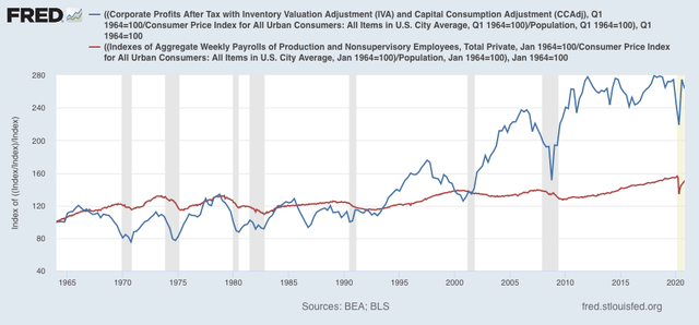
First, here is a graph comparing corporate profits adjusted for inflation, and total nonsupervisory wages, also adjusted for inflation. Both are also adjusted for population growth, so that we can see how much each has grown (or not) per person:

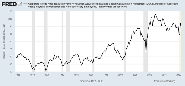
During the era of strong unions, ordinary workers got an increasing share of the pie. That reversed after the 1970s, took off in the 1990s, and really exploded after 2000. By 2020, real corporate profits per capita had grown by 75% more than total wages per capita:

All of which supports President Biden’s plan to raise corporate taxes to pay for infrastructure, as well as Treasury Secretary Yellen’s proposal for a global minimum corporate tax rate.
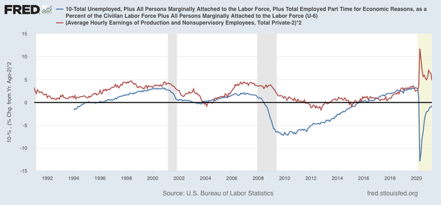
Next, let’s turn to underemployment and wage growth. One graph I used to regularly update was the U6 underemployment rate vs. YoY wage growth, which is a “long lagging” metric. In other words, typically an expansion has to be well underway before wage growth starts to accelerate. Based on the history of the broad measure of U6, which only goes back to 1994, it appears that it takes an underemployment rate of less than 10% for wage growth to finally tick up.
In the below graph, I subtract the U6 rate from 10 (blue), so that, e.g., an underemployment rate of 8% shows as +2%. In other words, the more the underemployment rate is under 10%, the more positive it shows. Meanwhile to account for the long term average inflation rate, I subtract 2% from YoY wage growth (red), and multiple *2 for scale:

The U6 rate as of March was 10.7%, and has declined by about 1% in the past 6 months. There are still about 8.4 million fewer workers, mainly from low-paying service jobs, than there were in February 2020. It will probably require the majority of them to be rehired before wage growth bottoms out.
