Over at Bruegel, Zsolt Darvas takes the ECB to task for systematic forecasting errors in the last five years. He shows that the ECB has persistently overestimated inflation and unemployment, and on this basis he questions the ECB's decision to end QE in December 2018. I share his concern that the ECB has tightened too soon, though as the ECB's QE program is seriously flawed and very damaging, I am not sorry to see the back of it.But I think that in focusing on the last five years, he has underestimated the scale of the ECB's failure. Here is his lovely chart showing Eurozone inflation since the creation of the Euro: The ECB's persistently high forecasts in the last five years are painfully apparent. But what interests me is not the forecasts, but the outturns. The entire chart shows a
Topics:
Frances Coppola considers the following as important: ECB, Eurozone, inflation, Monetary Policy, Unemployment
This could be interesting, too:
Matias Vernengo writes Serrano, Summa and Marins on Inflation, and Monetary Policy
Angry Bear writes Voters Blame Biden and Harris for Inflation
Lars Pålsson Syll writes How inequality causes financial crises
Matias Vernengo writes Inflation, real wages, and the election results
But I think that in focusing on the last five years, he has underestimated the scale of the ECB's failure. Here is his lovely chart showing Eurozone inflation since the creation of the Euro:
The ECB's persistently high forecasts in the last five years are painfully apparent. But what interests me is not the forecasts, but the outturns. The entire chart shows a marked downward trend. Inflation in the Eurozone has never been stable. Not once, in its entire history.
What the chart shows is systematic policy failure by the ECB. It has never maintained inflation at its policy target of "close to but below 2%". Most of the time, inflation has been well below target and falling. And the few times inflation has crept up to anywhere near the policy target, the ECB has pushed it down again. There has been a persistent deflationary bias in ECB policy decisions for the last 18 years.
So the over-optimism Darvas notes in the forecasts for the last five years is not a post-crisis phenomenon. The ECB has from the start used forecasting models that systematically over-estimate inflation.
The human cost of this deflationary bias is very high. This is Darvas's equally lovely unemployment chart:
So we have both a deflationary bias and a bias towards high unemployment in the models the ECB uses to produce its economic forecasts. Darvas offers an explanation for this, based on the internal inconsistency of the ECB's forecasts (my emphasis):
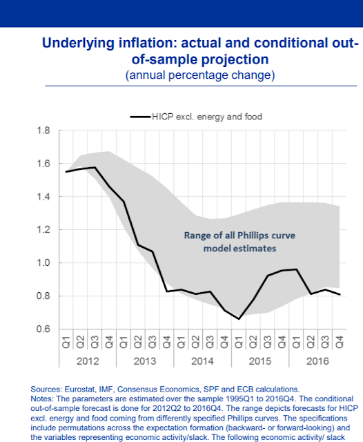
It is also notable that core inflation and unemployment rate forecast errors are inconsistent with each other. A faster than expected unemployment rate decline should have led to faster-than-expected inflation. But on the contrary, core inflation turned out to be lower than predicted. These forecast errors could highlight that the underlying Phillips-curve assumption of the ECB forecasts is flawed.It certainly is. Here is the Phillips curve-implied range of core inflation estimates plotted against actual HICP since 2012 (chart from ECB):
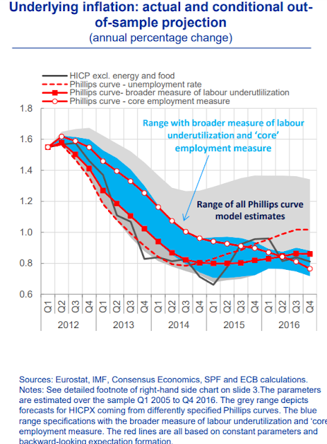
Core HICP is persistently right at the bottom of the Phillips curve model estimates, and sometimes even outside the range. I couldn't find a chart going back further, but given the evident deflationary bias in Darvas's inflation chart, I wouldn't be surprised to find that core HICP outturns have been at the bottom of the Phillips curve model estimates since 2000. There seems to be a systematic error in the Phillips curve model that causes it to generate implied core inflation estimates that are too high.
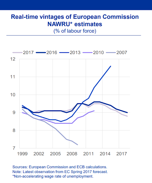
Perhaps because of this systematic error, estimates of the non-inflationary unemployment level are also too high. Here's a chart showing estimates of the non-accelerating wage rate of unemployment (NAWRU) since 1999 (chart from ECB):
There are two points to note here. The first is the expectation of high unemployment. The ECB has persistently estimated that inflation will start to rise if unemployment falls much below 9%. In the light of this, the ECB's pessimistic unemployment estimates may be a blessing in disguise. If the ECB forecast unemployment accurately, it might run much tighter monetary policy.
The second point is variability. Unless there is a considerable drop in productive capacity, the NAWRU should not rise substantially. But in 2013, the ECB/EC forecast an exponential rise in the NAWRU that, if followed through to its logical conclusion, would eventually mean inflation would not be stable at any level of unemployment. This is what I would expect to see in a collapsing economy such as Venezuela. What did the ECB/EC think it was doing, forecasting this when the Eurocrisis was already supposedly under control? Had the 2013 estimate been right, it would have indicated a massive policy failure by Eurozone authorities, including (since the forecast implies inflation could not be stabilised) the ECB.
These estimates are frankly absurd, especially in the light of the subsequent outturns. HICP inflation has been well below target and far below the Phillips curve implied estimate. If the Phillips curve relationship holds, therefore, the NAWRU is too high.
In a remarkable attempt to dig the ECB out of this hole, Benoit Coeure blamed the discrepancy between HICP and Phillips curve estimates on "hysteresis":
...If the effect of low expectations and high uncertainty is to quell animal spirits, large demand shocks can have long-lasting effects: the increase in risk aversion slows down capital accumulation, thereby reducing productivity growth, while uncertainty encourages firms to enter into more flexible forms of employment that shed labour market risks onto workers.It's certainly reasonable to count underemployment and insecure employment in measures of labour market slack. And when these are included, core HICP does track the Phillips curve model estimates better:This then feeds back into wage growth in three ways: (i) through lower labour productivity, which depresses real wages, (ii) through a higher level of effective labour market slack and (iii), in an environment of high uncertainty, through employees and trade unions valuing job security more than higher wages – in particular after recessions where wage growth would likely have been negative for a while had it not been for downward nominal wage rigidity.
Put differently, what we could be seeing today is a hysteresis in the euro area economy that has an effect on wages quite unlike that of “traditional” labour market hysteresis.
So, as an explanation of unexpectedly low inflation despite falling unemployment post-crisis, this is perhaps credible. But it doesn't begin to explain the deflationary bias in ECB policy and persistently high Eurozone unemployment prior to the crisis.
Darvas's final chart does, however, offer a reason for the deflationary bias in both pre- and post-crisis ECB policy:
Both before and after the Great Recession, the market expectation was that inflation would meet or exceed the ECB's target both in the short- and longer-term. This changed when the Eurozone crisis hit: from October 2012 onwards, markets gradually stopped believing that inflation would return to target in the short-term, but there was still faith in the inflation target for the longer term. Not until mid-2014 did longer-term inflation expectations start to tail off. Could it be that the ECB's persistent forecasting errors were raising inflation expectations, leading to policy errors?
If so, this could create a nasty feedback loop. The Phillips curve is expectations-augmented, which means that expectations of future inflation feed into estimates of the non-inflationary level of unemployment (NAIRU). Anomalously high inflation expectations caused by previous forecasting errors would raise both future HICP estimates and the NAIRU, thus keeping inflation expectations anomalously high and leading to further policy and forecasting errors. Both inflation expectations and forecasts would persistently exceed the outturn - as indeed they did. Though you would think someone would have noticed this, wouldn't you?
But this raises another question. If the ECB's forecasting errors were raising inflation expectations, why did short-term inflation expectations start to fall in October 2012, and long-term in mid-2014? This is the more interesting question. Did markets ignore both the ECB's forecasts and its forward guidance? If so, then the disinflationary trend in inflation expectations should have worried ECB policymakers. If markets don't believe a word a central bank says, it has virtually no chance of controlling inflation, as the Bank of Japan knows to its cost. For the ECB, whose only mandate is price stability, losing control of inflation expectations is an existential threat. To be fair, the fact that inflation expectations were becoming unanchored on the downside was the ECB's stated reason for starting QE in 2015.
But if losing control of inflation expectations is an existential threat, surely failing to meet its mandate even once in 18 years must be, too. The ECB has not delivered price stability. Instead, it has delivered persistent disinflation and unnecessarily high unemployment. Darvas's inflation chart is the graphic record of the ECB's failure. The cost in ruined lives is yet to be calculated.
Darvas cautions against further monetary tightening:
For this period I recommend an extremely cautious approach to monetary tightening due to all the past forecasting failures. The forecasts themselves should not be enough to justify a rate increase. A rate increase is only recommended after a significant increase of actual core inflation. I also suggest making this intention clear in the ECB’s forward guidance.I have to agree. But then I have said this all before (see Related Reading for an edited selection of posts going back to 2012). The ECB's policy inaction, justified by frankly incredible inflation forecasts, caused an entirely unnecessary depression and ruined the lives of millions. It is a disaster.
Related reading:
Central banks' credibility problem
Euro area depression, charted
The ECB is not doing its job. Again.
Deflation and the ECB
A central bank crisis
It's the currency, stupid
Scars or scratches? Hysteresis in the Euro area (slides) - ECB
I very much look forward to reading Darvas's paper when it is released. Link will be posted here in due course.


