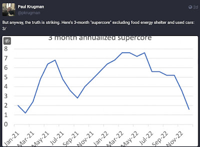
How “FHFA-CPI” using house prices rather than OER shows a sharp deceleration in inflation – by New Deal democrat Paul Krugman made another foray into the “inflation is mostly gone” genre over the weekend with a thread on Mastodon that largely relied on the following graph: concluding that “[A]t this point the burden of proof lies on anyone claiming that we had more than a, well, transitory inflation spike that’s mostly behind us.” I’m very disappointed with Krugman’s argument, mainly because his “supercore” measure of inflation boils down to “if we exclude all the items that CPI says are really going up in price, plus gas, then things aren’t really going up in price.” Well, duh. Since the inflection point of all this
Topics:
NewDealdemocrat considers the following as important: Hot Topics, inflation, New Deal Democrat, politics, US EConomics
This could be interesting, too:
Robert Skidelsky writes Lord Skidelsky to ask His Majesty’s Government what is their policy with regard to the Ukraine war following the new policy of the government of the United States of America.
NewDealdemocrat writes JOLTS revisions from Yesterday’s Report
Joel Eissenberg writes No Invading Allies Act
Ken Melvin writes A Developed Taste
How “FHFA-CPI” using house prices rather than OER shows a sharp deceleration in inflation
– by New Deal democrat
Paul Krugman made another foray into the “inflation is mostly gone” genre over the weekend with a thread on Mastodon that largely relied on the following graph:

concluding that
“[A]t this point the burden of proof lies on anyone claiming that we had more than a, well, transitory inflation spike that’s mostly behind us.”
I’m very disappointed with Krugman’s argument, mainly because his “supercore” measure of inflation boils down to “if we exclude all the items that CPI says are really going up in price, plus gas, then things aren’t really going up in price.”
Well, duh.
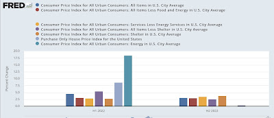
Since the inflection point of all this argumentation is June, I thought I’d try a fairer representation of the main sectors involved. So, below is a bar graph that breaks all of the measures down to the First and Second Halves of 2022, starting with overall inflation (blue), then subtracts food and energy (red), energy (gas) (gold), and shelter (purple). The final three bars focus on shelter (brown), house prices via the FHFA purchase only index (lavender), and finally energy (teal):

This makes it clear that both total and core inflation aren’t very different in H2 than in H1. In fact as officially measured shelter prices accelerated from +2.7% in H1 to +3.8% in H2.
The big declines are in house prices, which aren’t in the official CPI and which declined from +8.6% in H1 to -0.4% (-0.27% through October, the last month reported, extrapolated to 6 months) in H2; and energy, which decelerated from +18.2% in H1 to +0.3% in H2 (this despite the huge drop in gas prices from $5 to $3 between June and December).
So I disagree with Prof. Krugman’s analysis using his cherry-picked “supercore.” Inflation, as officially measured, isn’t “mostly behind us.”
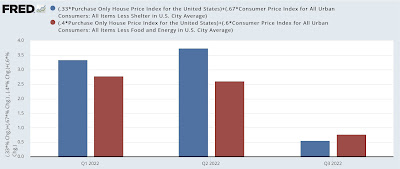
Nevertheless, if the question is, “Should the Fed continue to raise rates?” then I arrive at the same conclusion, but for a different reason; namely, that officially measured CPI for shelter lags what is actually happening in the housing market (as represented by prices) by 12 or more months. I show that below via “FHFA-adjusted” total and core CPI, which substitutes the FHFA purchase only index for CPI shelter. The only difference is, since the FHFA has only been reported through October, the below graph is quarterly rather than semi-annual:

Now it is clear just how much inflation, as it more properly ought to be considered by the Fed, has sharply decelerated since June.
