How effective is monetary policy?Highly effective, according to the Governor of the Bank of England. In a speech earlier this week, Mark Carney robustly defended the Bank of England's record: "Simulations using the Bank’s main forecasting model suggest that the Bank’s monetary policy measures raised the level of GDP by around 8% relative to trend and lowered unemployment by 4 percentage points at their peak. Without this action, real wages would have been 8% lower, or around £2,000 per worker per year, and 1.5 million more people would have been out of work." Well, lots of us might agree that monetary policy did help to offset the damaging effects of bank and household deleveraging in the aftermath of the worst financial crisis since the 1930s.Carney suggested that monetary policy also dampened the effect of premature fiscal consolidation when everyone panicked about government deficits in the wake of the Greek crisis: Fiscal policy quickly came under severe strain as tax revenues plunged, the costs of social benefits rose sharply, and the huge bills for too-big-to-fail banks came due. Since then sustained austerity has reduced the fiscal deficit from around 10% of GDP in 2010 to around 3 ½ % today. While necessary, this has, on average, subtracted around 1 percentage point from demand each year.
Topics:
Frances Coppola considers the following as important: benefits, Brexit, fiscal policy, housing, Monetary Policy, wealth
This could be interesting, too:
Nick Falvo writes Subsidized housing for francophone seniors in minority situations
NewDealdemocrat writes Declining Housing Construction
Nick Falvo writes Homelessness among older persons
Bill Haskell writes Q3 Update: Housing Delinquencies, Foreclosures and REO

How effective is monetary policy?
Highly effective, according to the Governor of the Bank of England. In a speech earlier this week, Mark Carney robustly defended the Bank of England's record:
"Simulations using the Bank’s main forecasting model suggest that the Bank’s monetary policy measures raised the level of GDP by around 8% relative to trend and lowered unemployment by 4 percentage points at their peak. Without this action, real wages would have been 8% lower, or around £2,000 per worker per year, and 1.5 million more people would have been out of work."Well, lots of us might agree that monetary policy did help to offset the damaging effects of bank and household deleveraging in the aftermath of the worst financial crisis since the 1930s.
Carney suggested that monetary policy also dampened the effect of premature fiscal consolidation when everyone panicked about government deficits in the wake of the Greek crisis:
Fiscal policy quickly came under severe strain as tax revenues plunged, the costs of social benefits rose sharply, and the huge bills for too-big-to-fail banks came due. Since then sustained austerity has reduced the fiscal deficit from around 10% of GDP in 2010 to around 3 ½ % today. While necessary, this has, on average, subtracted around 1 percentage point from demand each year. Over that time, structural policies have boosted participation in the labour market but have been unable to return productivity growth to anything resembling its historic average. For seven years, in the face of severe headwinds to growth, monetary policy has been the only game in town.He is probably right. The counterfactual is the Eurozone, where severe fiscal consolidation has been undertaken by several countries without monetary policy support. Eight years on, unemployment remains distressingly high, growth is flat and inflation is negative, reflecting a massive collapse of aggregate demand. The ECB's monetary easing has been too little, too late for countries like Spain, where some of the unemployed have been out of work for over four years. Whole generations have been thrown on the scrapheap because of monetary and fiscal intransigence. Eventually, the price for such harshness will be paid politically.
But the most persistent criticism of monetary policy is that it has, in the words of HSBC's Stephen King, "unfortunate distributional effects". It benefits the holders of financial assets - primarily the rich - at the expense of those dependent on interest income, who are believed to be much poorer, though not necessarily the poorest.
Carney is having none of it. He rejected the distributional criticism of monetary policy on the grounds that savers are also asset holders:
Just 2% of households have deposit holdings in excess of £5,000, few other financial assets, and don’t own a home. So the vast majority of savers who might have lost some interest income from lower policy rates have stood to gain from increases in asset prices, particularly the recovery in house prices.Of course, realising those gains is not necessarily easy. Your house may have gone up in value, but you are still living in it. For those trying to live on declining interest income from savings, asset price rises are cold comfort.
But Carney is not having that either. He points to these two charts as evidence that the poor have done better than the rich from monetary policy:

The wealth increase of the top two quintiles is easily explained. These quintiles not only own property, they own financial assets - and monetary policy has increased the value of financial assets. But the rest of the chart is much less clear.
This is the UK's wealth distribution in 2012-14, from the fourth and final "wave" of the Wealth and Assets Survey (WAS). The divisions are deciles: the Bank of England has used quintiles, but these are easy to derive from this chart.
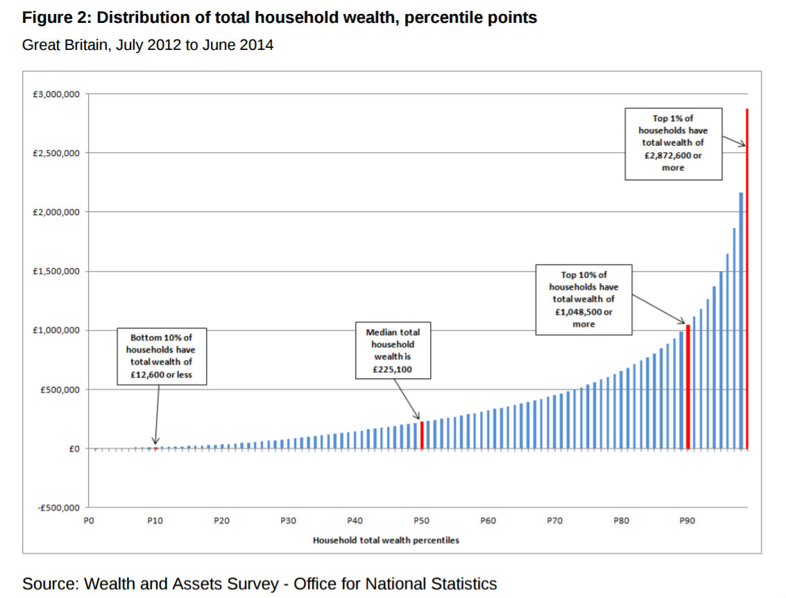
Wave 4 of the WAS does say that the principal form of wealth for poorer people is property. However, the survey says that only 40% of those in the bottom half of the wealth distribution own property - i.e. P50 and below. That includes the lower-middle quintile and part of the middle quintile in the Bank of England's chart. Given that only about two-thirds of UK households own property, and the proportion of high-wealth households that own no property is vanishingly small, it is highly unlikely that the lowest quintile (P0 to P20) would include sufficient homeowners for property rises to have such a dramatic effect on net wealth for that quintile.
I think the net wealth changes for the poorest quintile are much more likely to stem from rapid buildup and deleveraging of unsecured debt (credit cards and high-interest loans), followed by renewed saving. This is supported by this statement from Wave 1 of the WAS (2006-8):
25 percent of households had net financial wealth that was negligible: a large number of households at the lower end of the distribution had negligible, zero or negative net financial wealth.The poorest 20% didn't have mortgages, they had credit cards and payday loans. And in the deep recession after the financial crisis, they defaulted on them. Many of them had their possessions seized to pay off debts. The few that might have owned houses in 2006 don't, any more. Now, they are free of debt and are beginning to build up savings, perhaps with the help of charities such as Stepchange.
Can monetary policy take the credit for this? Absolutely not. If there had been no monetary policy support, far more of this group would have defaulted on their debts. Under UK law, if debt default results in personal bankruptcy, the individual is not left destitute. Possessions are seized, yes, but the individual is allowed to keep sufficient possessions to support a basic lifestyle. Writing off the debts therefore leaves the individual with net positive wealth. The Bank of England's chart is absolutely correct to show this as a noticeable increase in net wealth for the poorest 20%, but this is not due to monetary policy. It is due to the disastrous 2008 crash, the personal bankruptcies that resulted from it, and the determination of many of this group never to be so vulnerable again. Perversely, monetary policy has if anything impeded the deleveraging of this group and restricted improvement in net wealth.
That said, monetary policy has to some extent protected the poorest quintile from high unemployment and large income falls. So, indirectly, it has helped them to pay off problem debt and start to build up savings.
Now we have explained the wealth increases of the richest and the poorest on the Bank of England's chart. That leaves the lower-middle and middle income quintiles (P20 to P60) - what we might call the "in-betweeners".
These people were not as vulnerable as the poorest group in the 2008 crash. They had higher levels of property ownership than the bottom quintile, less unsecured debt and more savings.. But the chart shows that as a group, they have apparently been largely unaffected both by the 2008-10 housing market crash and the subsequent housing market recovery. This cannot be explained by the fact that most homes are mortgaged. Mortgages are nominal, not real. They do not increase and decrease in response to house price changes. When the price of a mortgaged home rises, the homeowner's net wealth increases. So why have house price rises had so little effect on the wealth of the in-betweeners?
My reading of the chart is that it is the in-betweeners, not the poorest, that suffered distressed deleveraging of property debt. The WAS says that much of their wealth is tied up in property: Wave 2 tells us that the average value of their property fell sharply in 2008-10, in some areas by over 8%. But if the aggregate value of their mortgages also fell, because they were paying them off, then the net wealth of the group as a whole would remain the same even though house prices were falling.
Once the housing market started to recover, of course, the deleveraging stopped and new buyers entered the market, all of them mortgaged to the hilt. So although mortgages themselves don't adjust with property prices, rising property wealth for the "in-betweeners" is nonetheless offset by rising mortgage debt. Net wealth for these groups therefore does not rise as fast as it does for richer groups, who are much less likely to be mortgaged and for whom property wealth is less significant anyway. (The WAS says that pensions - notably defined-benefit pensions - are the most important part of the wealth of the top two quintiles.)
Can monetary policy claim credit for this? Not really. The US experienced a much worse property market crash than the UK despite drastic interest rate cuts and large amounts of QE. The reasons why the UK did not experience a housing market correction on the scale of 1990 are something of a mystery, but restricted supply, political support for the housing market through a variety of fiscal initiatives, and the rise of London property as an international safe asset are all important factors.
So now we have a full explanation for the wealth chart. Monetary policy supported the rich - we knew that. It supported the poor to some extent, though it was far from being the sole cause of the large increase in wealth evident from the chart. But it didn't help the in-betweeners much.
Now to the income chart. Once again, it shows a large increase for the poorest. Can monetary policy lay claim to this? No. This is mostly due to fiscal policy. The ONS observes that incomes in the lower half of the income distribution are extensively smoothed by benefit top-ups. Working-age benefits rose from 2007 to 2010, then were cut back sharply by the Coalition government. This should have caused aggregate income in the bottom two quintiles to fall, but the cutbacks were offset by rising payments to retirees and increases in the minimum wage. The resulting income stagnation from 2010-13 is apparent from the chart.
The income chart does show that the incomes of the higher quintiles have been squeezed. But when your own income is stagnating, you feel angry about the rich even if their incomes are falling. The position of the middle quintile is particularly stark: their income was flat from 2007 to 2013. They could be forgiven for thinking that monetary policy passed them by.
So, Governor, I remain unconvinced that monetary policy has been "highly effective". There are many moving parts in this particular machine, and you have ignored most of them.
It is all very well crowing that the poorest have been supported. They have, to some extent, though perhaps not quite as much as you claim.
But it is painfully evident that the "in-betweeners" have had much less support. Relative to the rich, they have lost out both in wealth and in income. And relative to the poor, they have lost out too: they no longer qualify for many benefits and other public support, and they are seeing public money going to people not much poorer than them while they are left to struggle on their own. These are people who see themselves as having done everything right: they have worked hard, saved and paid into the system. Now, they think the system has abandoned them. And with reason.
To be fair, it is not the Bank of England that has abandoned them, though some of them blame you for their woes. The real failures lie on the fiscal side, and are of very long standing.
The promise of "cradle to grave" support upon which the British welfare state was founded has been systematically dismantled. Now, only the poorest are supported. The neglected in-betweeners are on their own. And their anger is shaking our political establishment to its foundations.
Related reading:
Austerity and the rise of populism
Raising interest rates is not that simple, Lord Hague
Image: "A mouse in between", by Open Graphics.